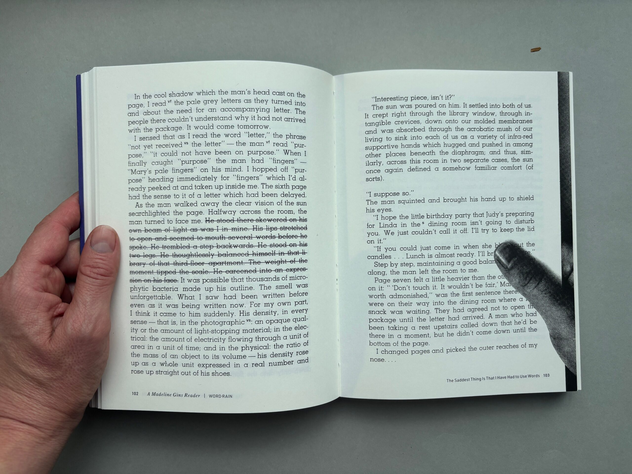
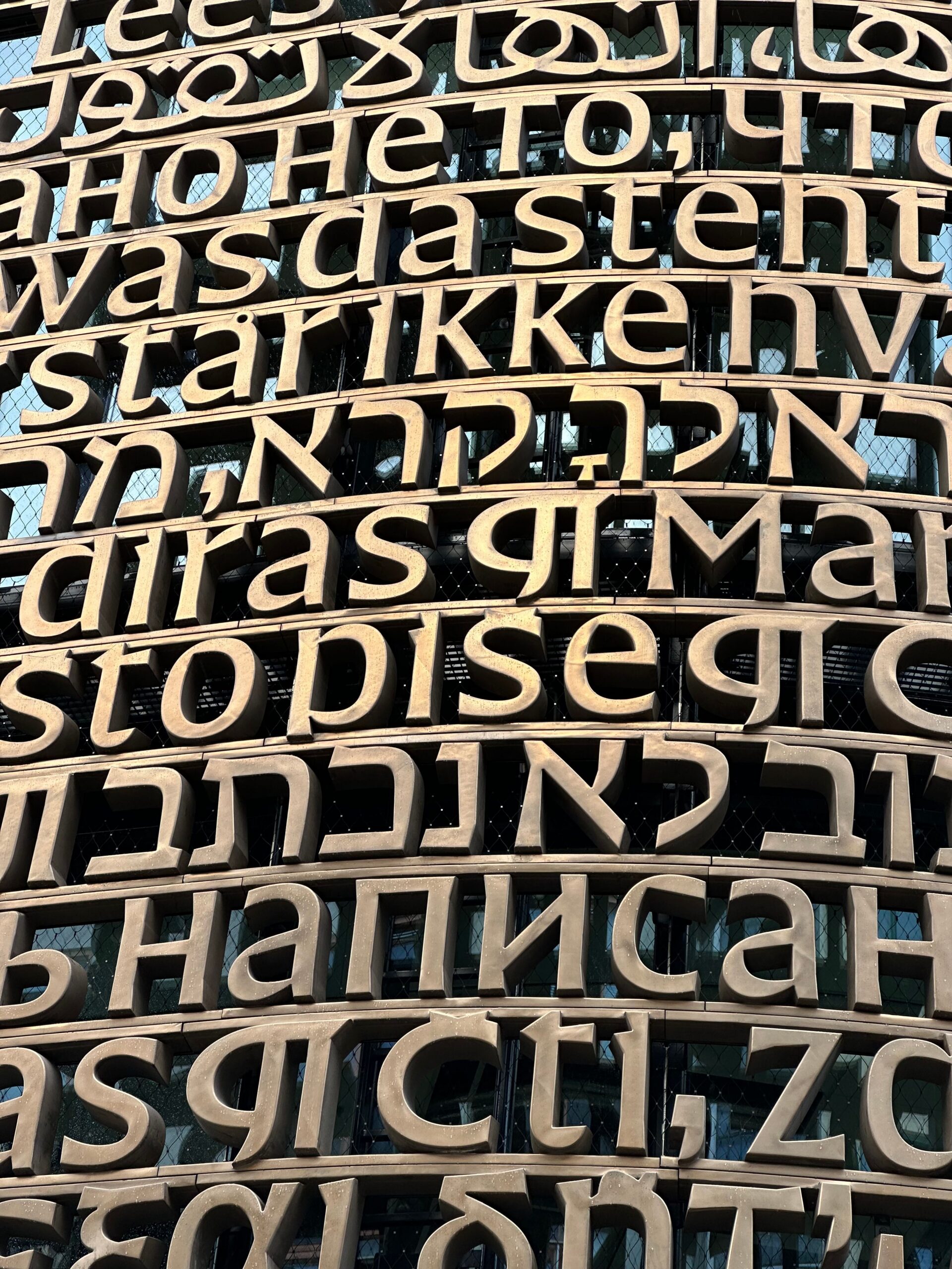
Word Rain is about a reader. The novel enacts the act of reading itself. Before the title page, a spread appears on which the background of the apartment is printed. The pages are unnumbered, and the book bulges with typographic interventions: a point that keeps hanging, words and paragraphs that suddenly appear in capitals, underlined or struck through, incomprehensible mathematical formulas. Language is pushed to the foreground as material. In Word Rain, language behaves like a horde of revolting parasites and reading becomes alchemical, synesthetic, uncontrollable. What I find extraordinary is how this book activates a reading that involves the whole body and truly engages all the senses. The reader-protagonist pays close attention to the sensory qualities of the manuscript: she feels the texture of the paper, smells the page, notices how the sun falls on certain words. Word Rain reminds you that reading goes far beyond the purely intellectual comprehension of words. Reading is a multisensory experience.
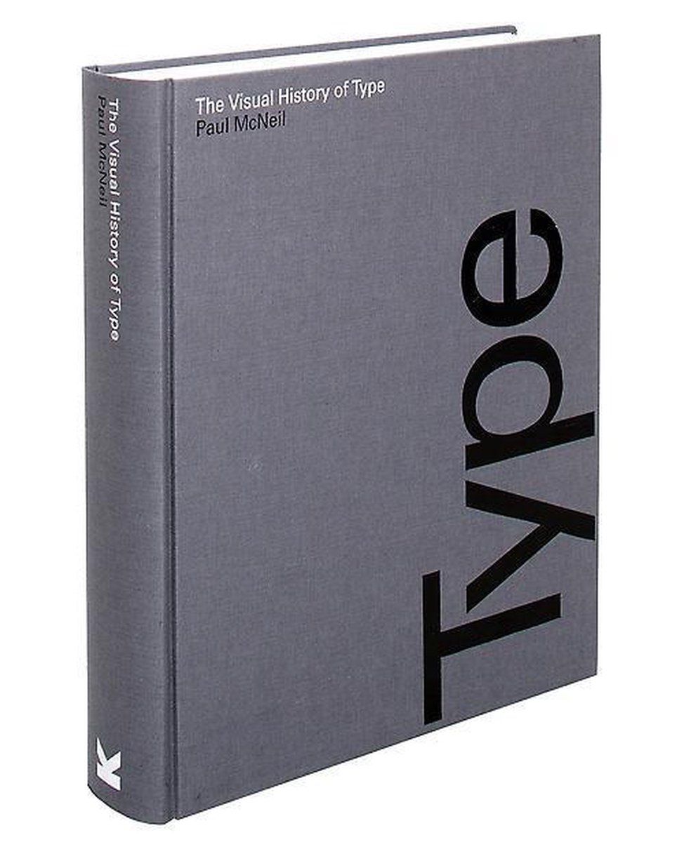
Visual History of Type is a complete visual survey of the history of type showing the original typefaces in the forms in which their designers intended them to be seen.
The book contains many archived scans of the original fonts.
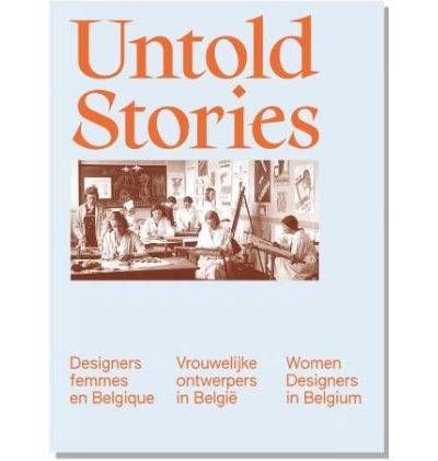
Untold Stories, Katarina Serulus, Marjan Sterckx & Javier Gimeno-Martinez, 2025
Untold Stories: Designers Femmes en Belgique/Vrouwelijke Ontwerpers in België/Women Designers in Belgium 1880-1980 is the continuation of the exhibition of the same name, which was held at the Design Museum Brussels until April 13, 2025. For the first time, it brought together the works of over 50 female designers and creators active in Belgium between 1880 and 1980.
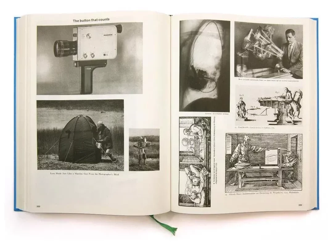
Two incredible books by Artist Batia Suter. The books are filled with found images taken from older books, encyclopedias, scientific publications, art histories, magazines, and archives and combined in a new associative manner.
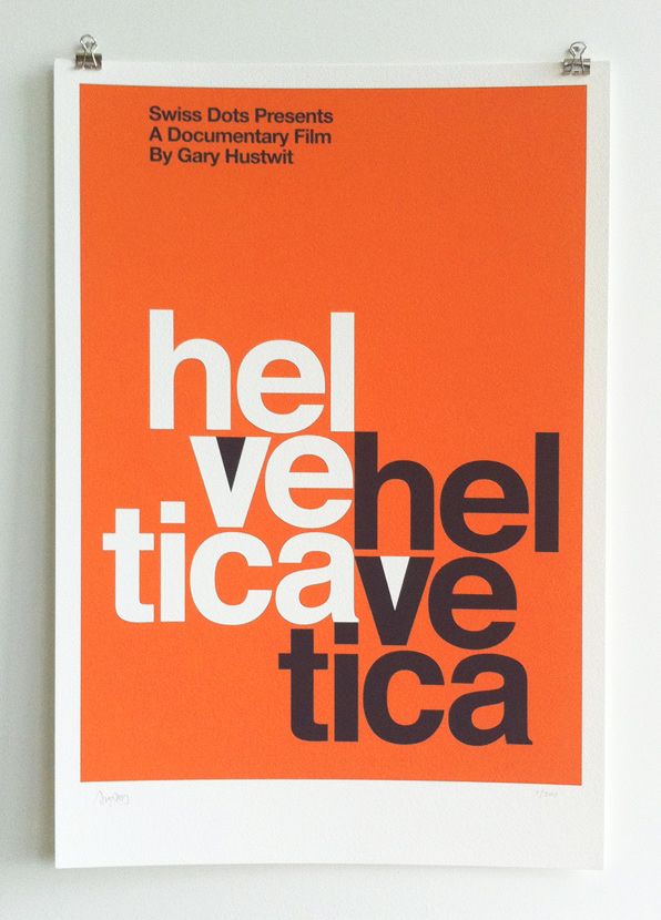
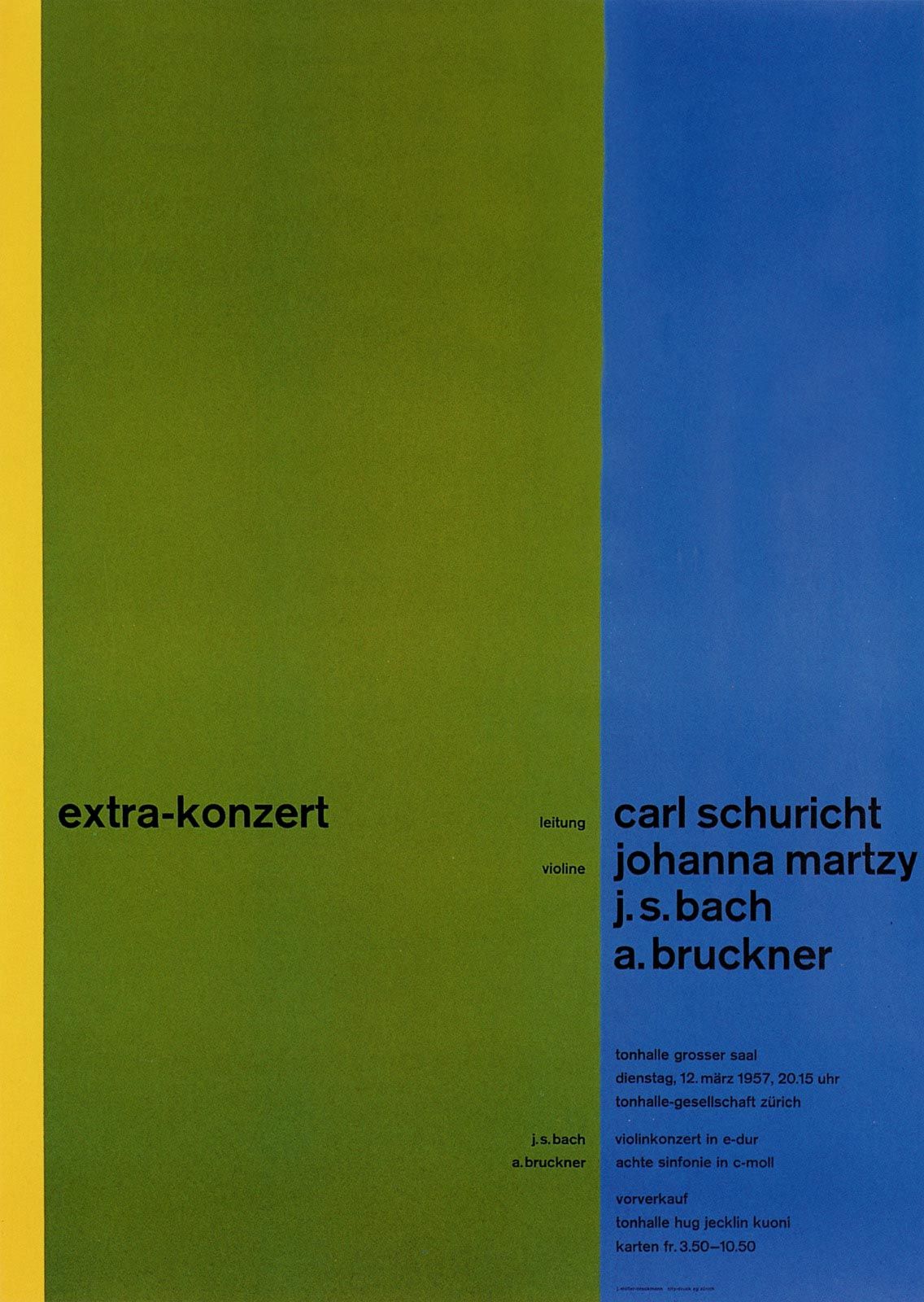
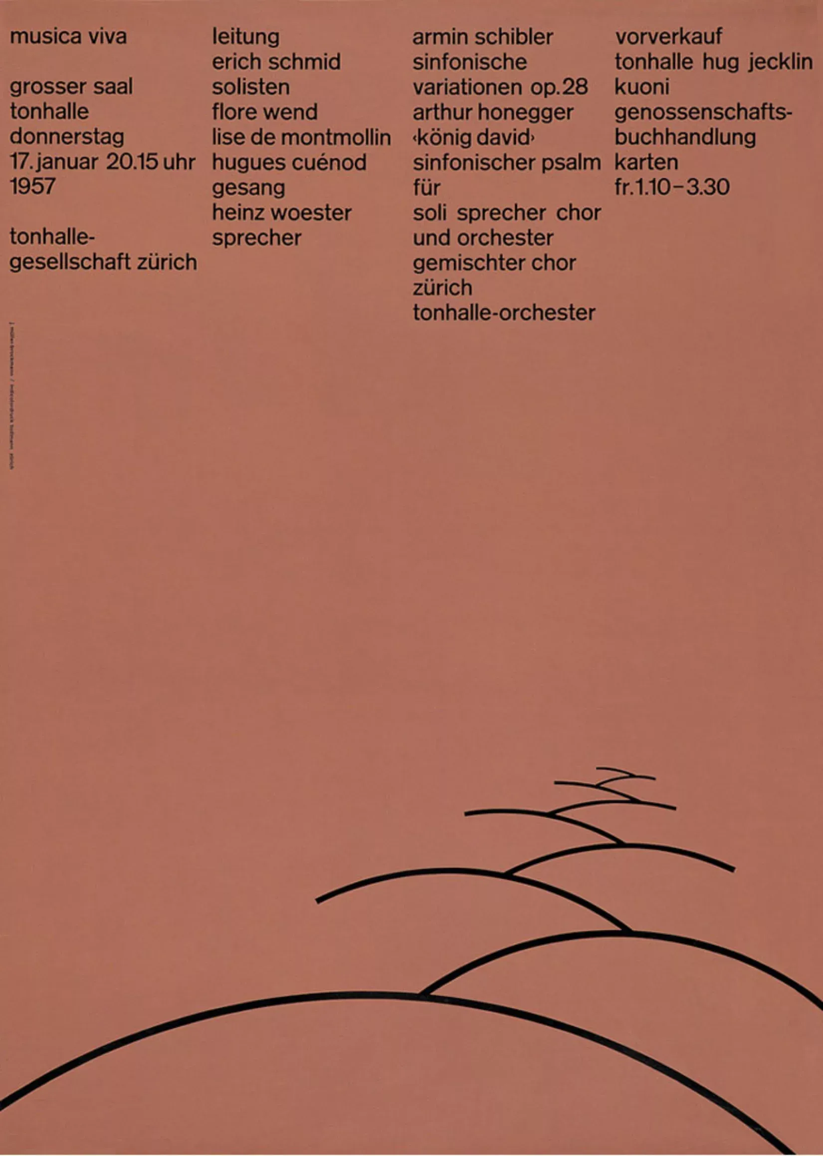
Zürich Tonhalle Concert, Josef Müller-Brockmann, 1958
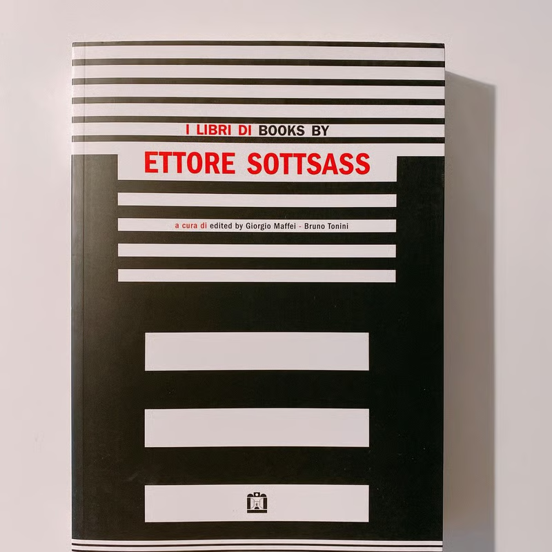
This book displays the many books, zines and book projects Ettore Sottsass made in his live. Sottsass is mostly known as a furniture and product designer but is a phenomenal boomaker, also. His ways of going about a page, composition, typography and image editing are joyful yet at times a little unhinged. Some designs are textured and can veen feel a little spartan, displaying the use of a tool or scruffy handwriting and nothing much else.
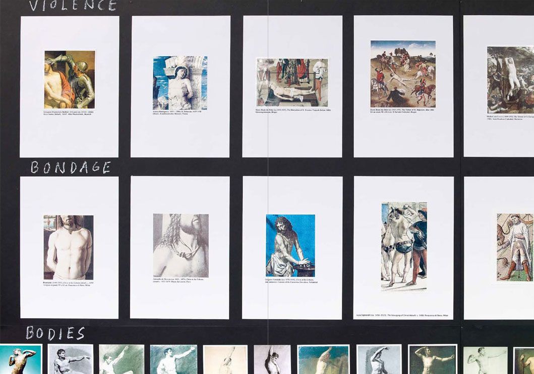
"Some Faggy Gestures the book" is better than the art work. The art work displays a large series of wooden panels on which Olesen lays out endless amounts of image clippings of the representation of queer bodies in classical painting, carefully categorized and labeled. We see images of male bodies fighting (very hot), mothers and their sons (very recongnizable), men bathing, butch women, effeminate poses (like hand in hip or staring into a distance). It's a striking work, yet the book is better as it provides a slower way of experiencing the work. Olesen's cut-out typography is charming and endearing. The work contains certain easter eggs, like some stills from a prison-themed porn video or a cute portrait of Queen's late frontman Freddie Mercury.
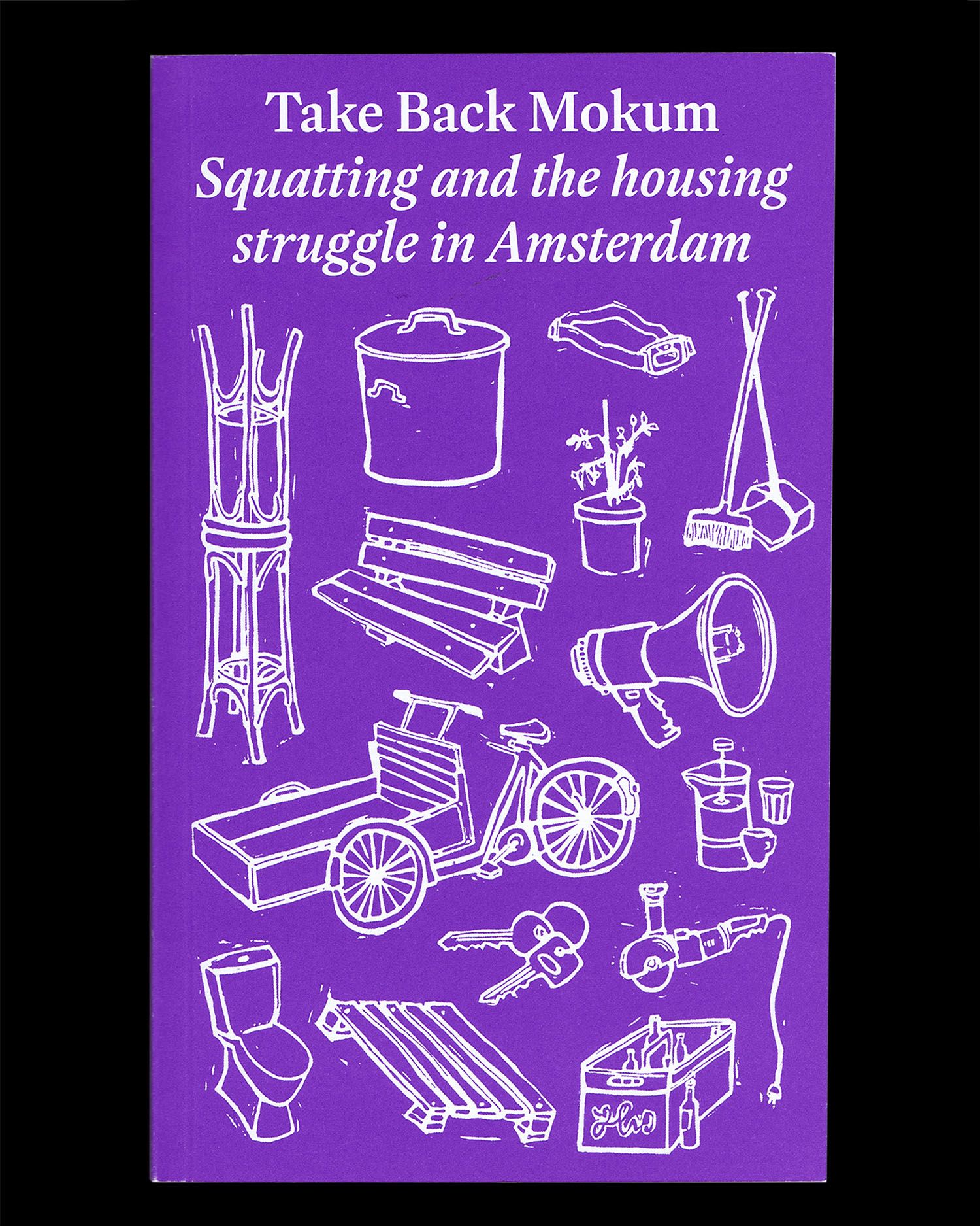
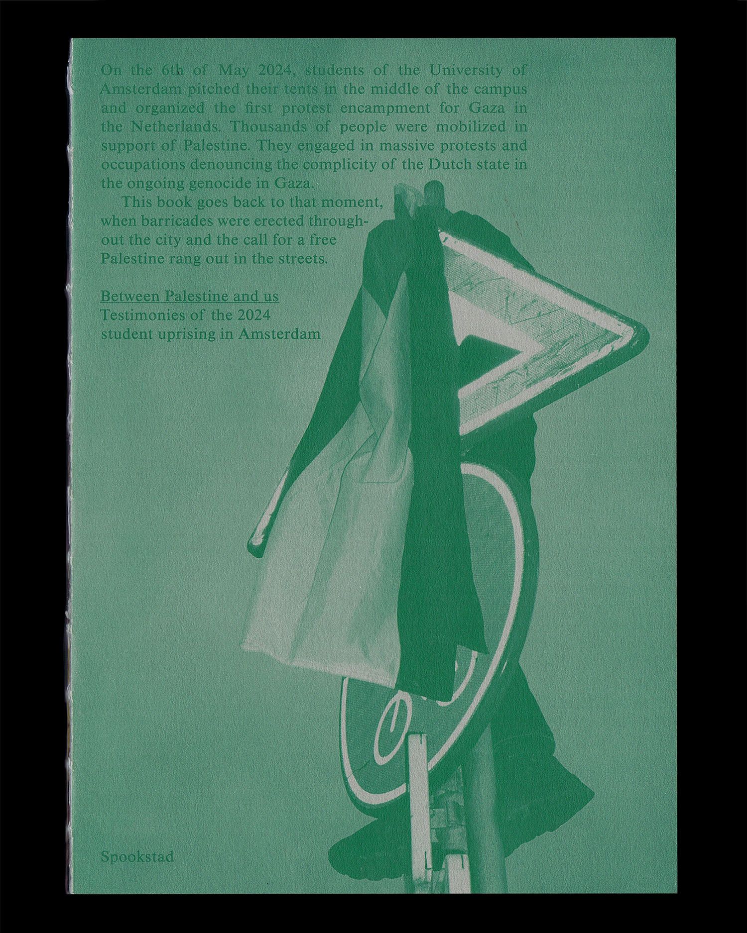
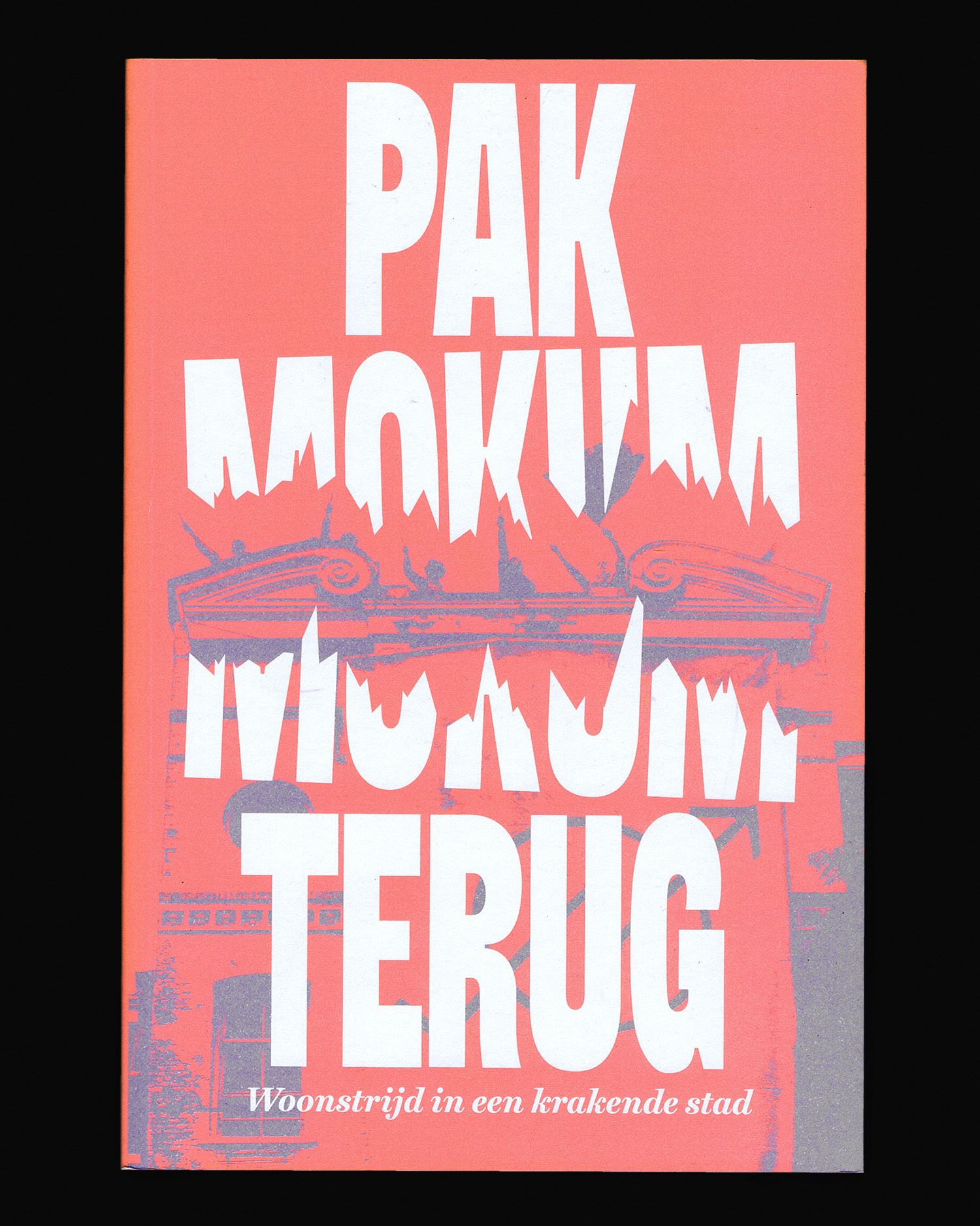
It's a publishing collective with a focus on activist topics and high quality design. Their books are very beautifully produced and the collective is a really great group of people.
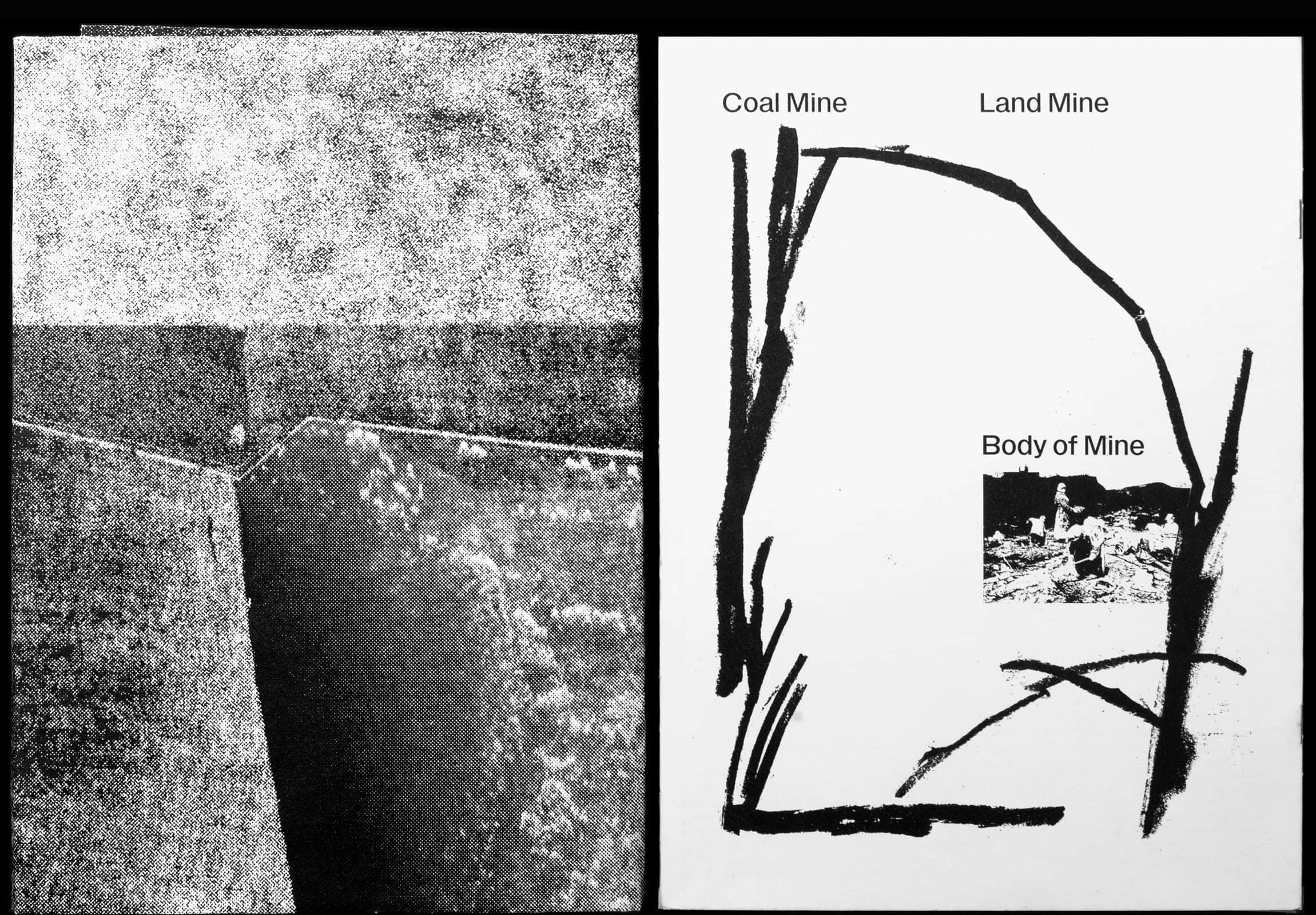
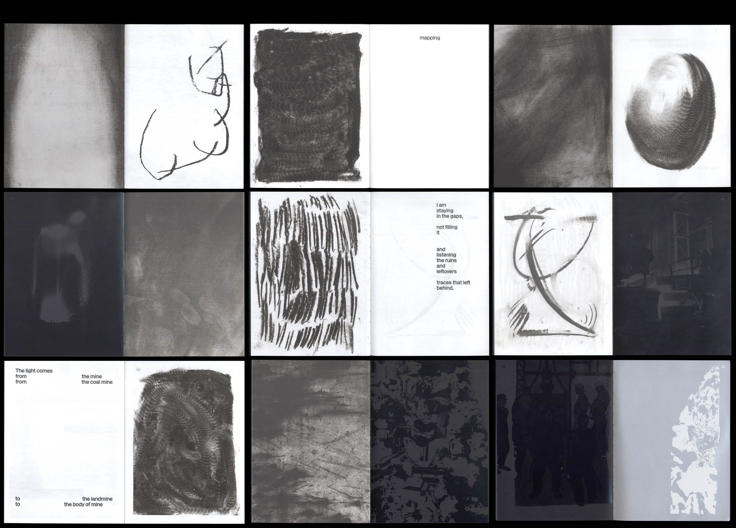
Stefaniia Bodnia made a very beautiful book for her graduation at the KABK, she is currently developing it further. It's based on her Ukrainian home region and touches upon geo-politics. It includes lots of interesting printing and production methods.
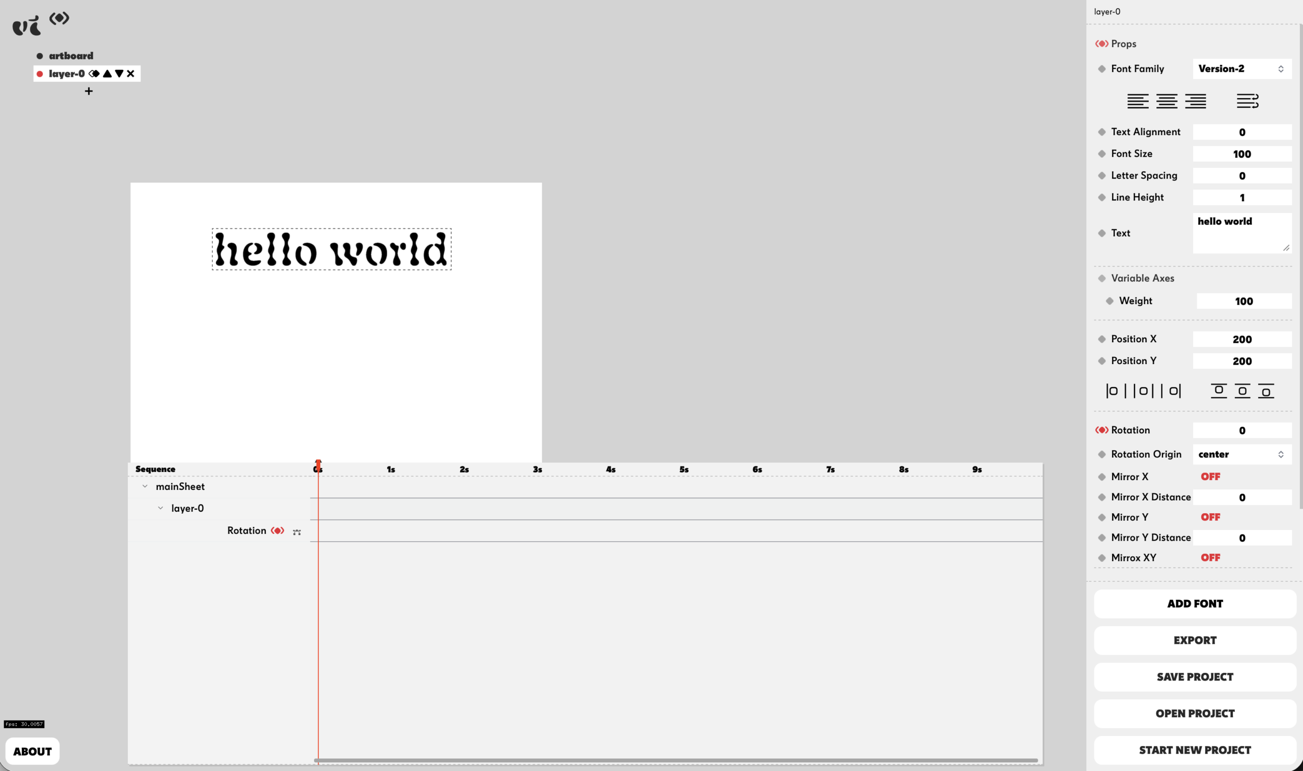
Variable Time was developed by Studio Pointer* in collaboration with me (Céline Hurka) as a free online tool to animate fonts and variable fonts. It's fully functioning and does not require sign-up.
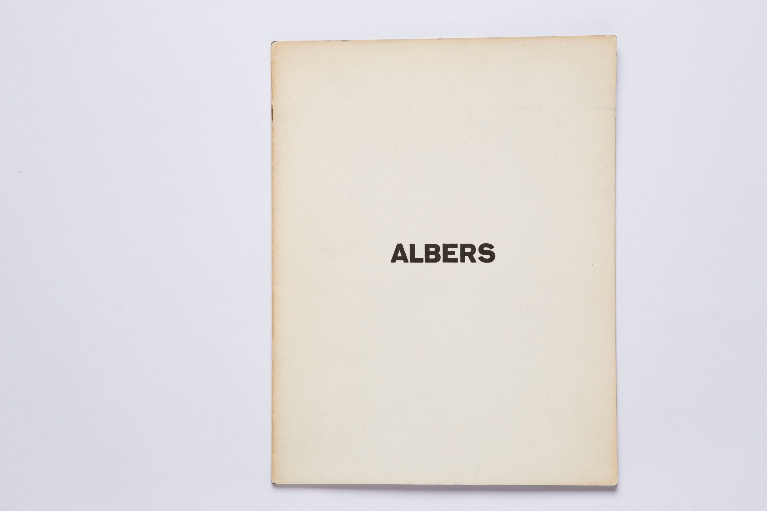
16pp – EN – 24 x 21.6 cm – softcover, stapled
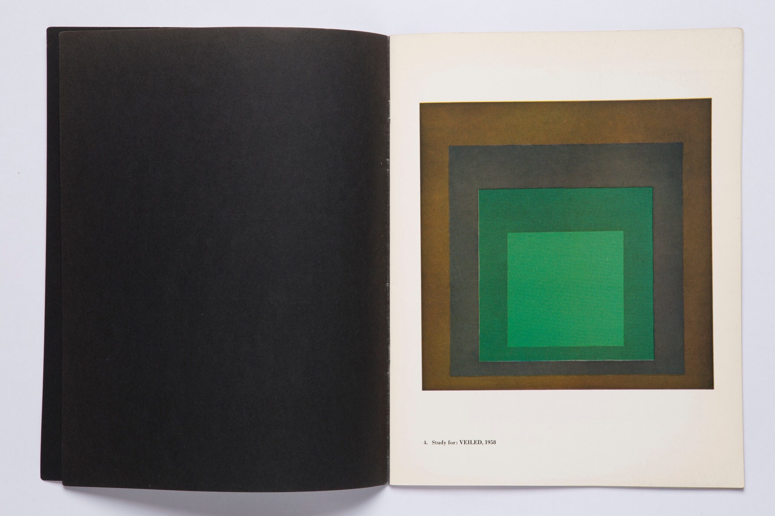
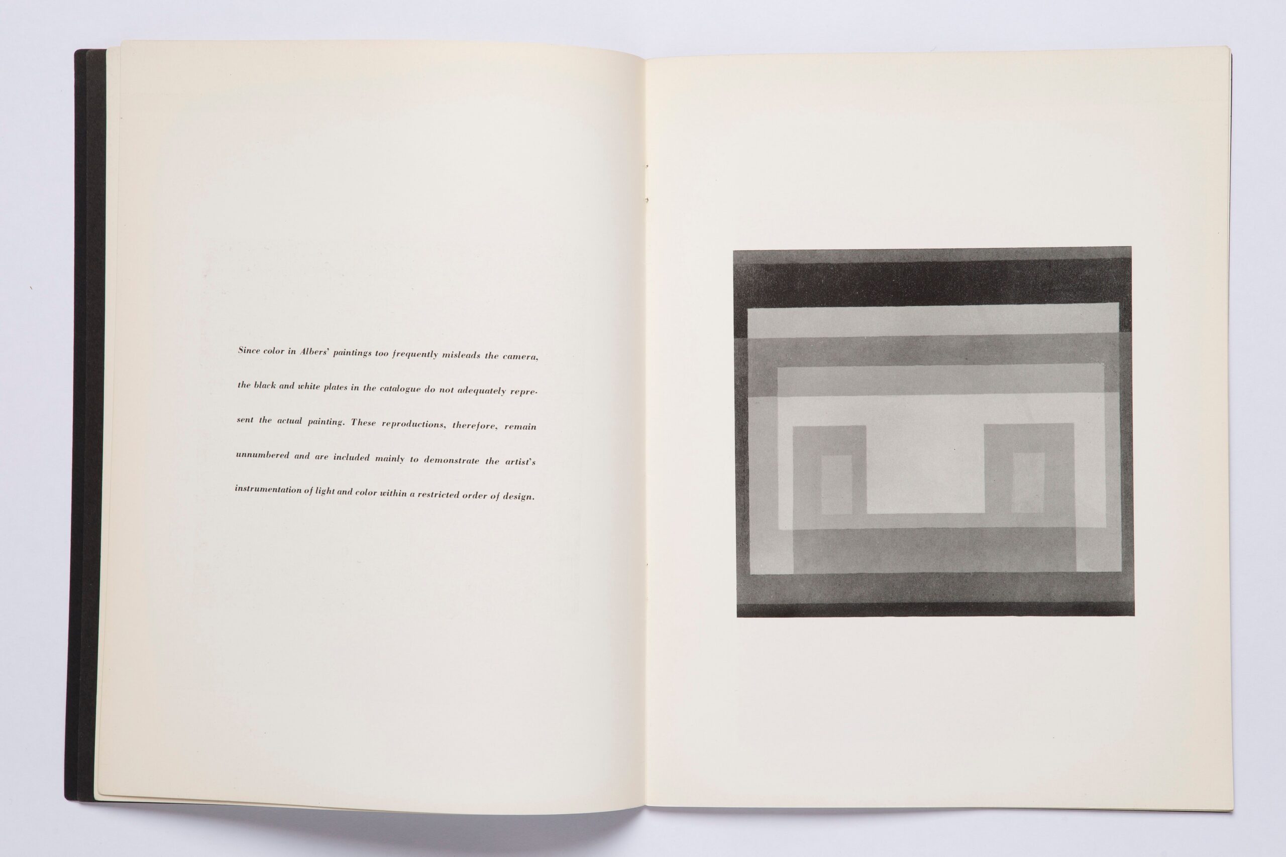
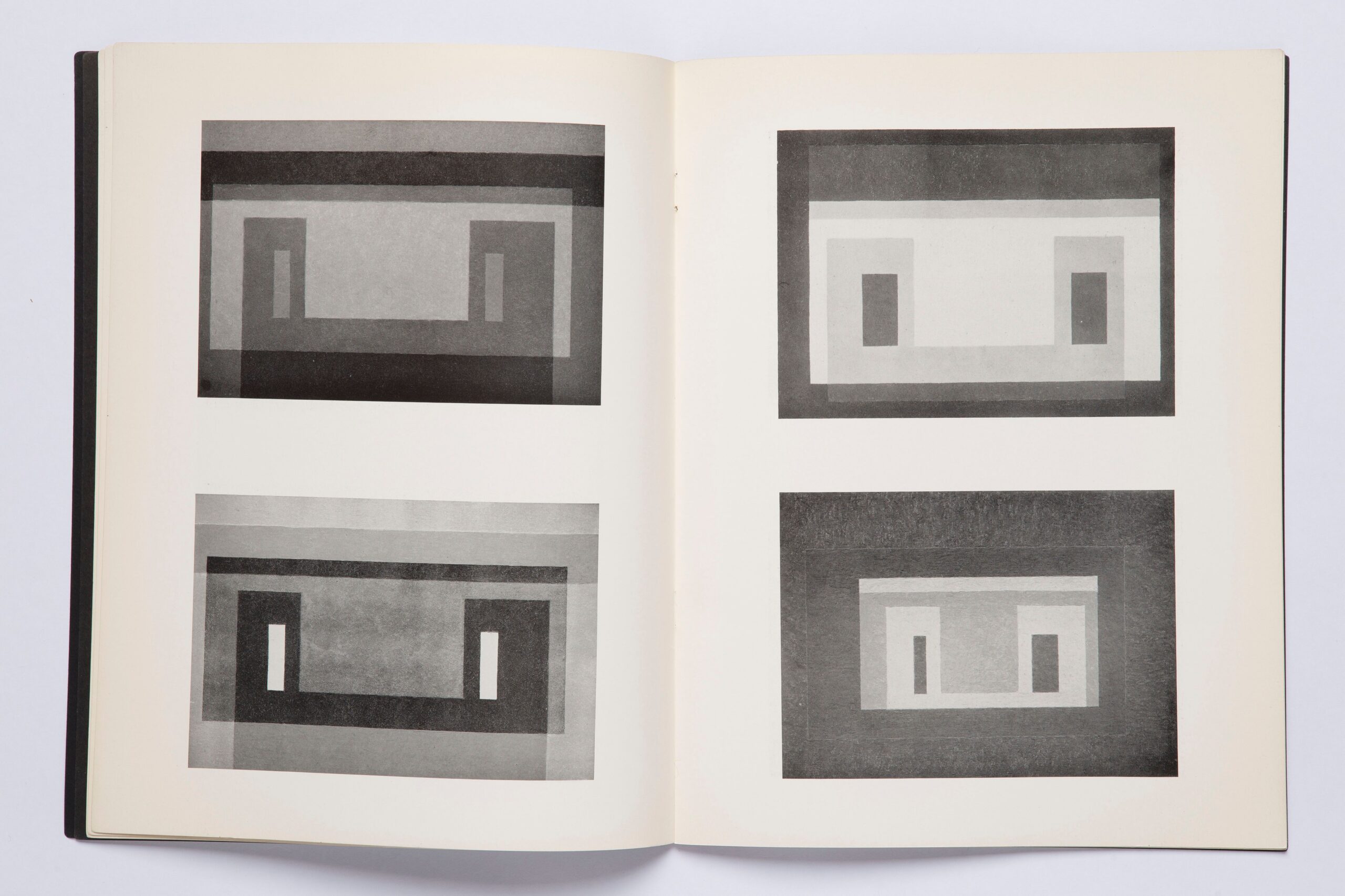
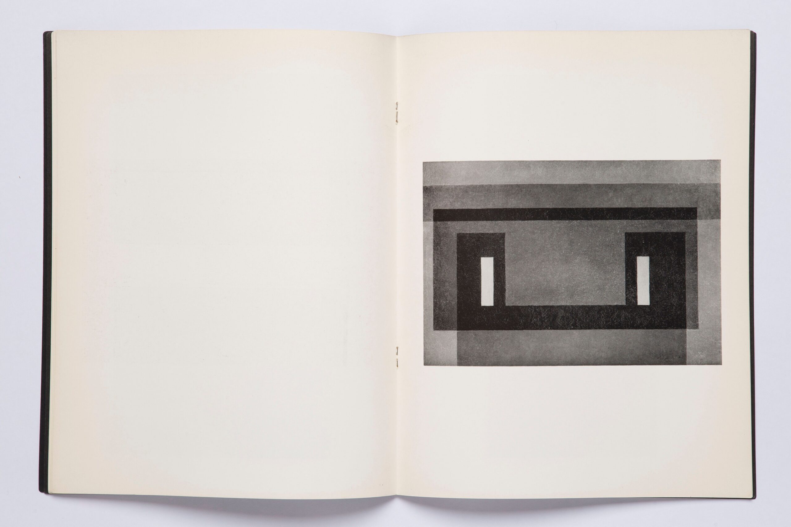
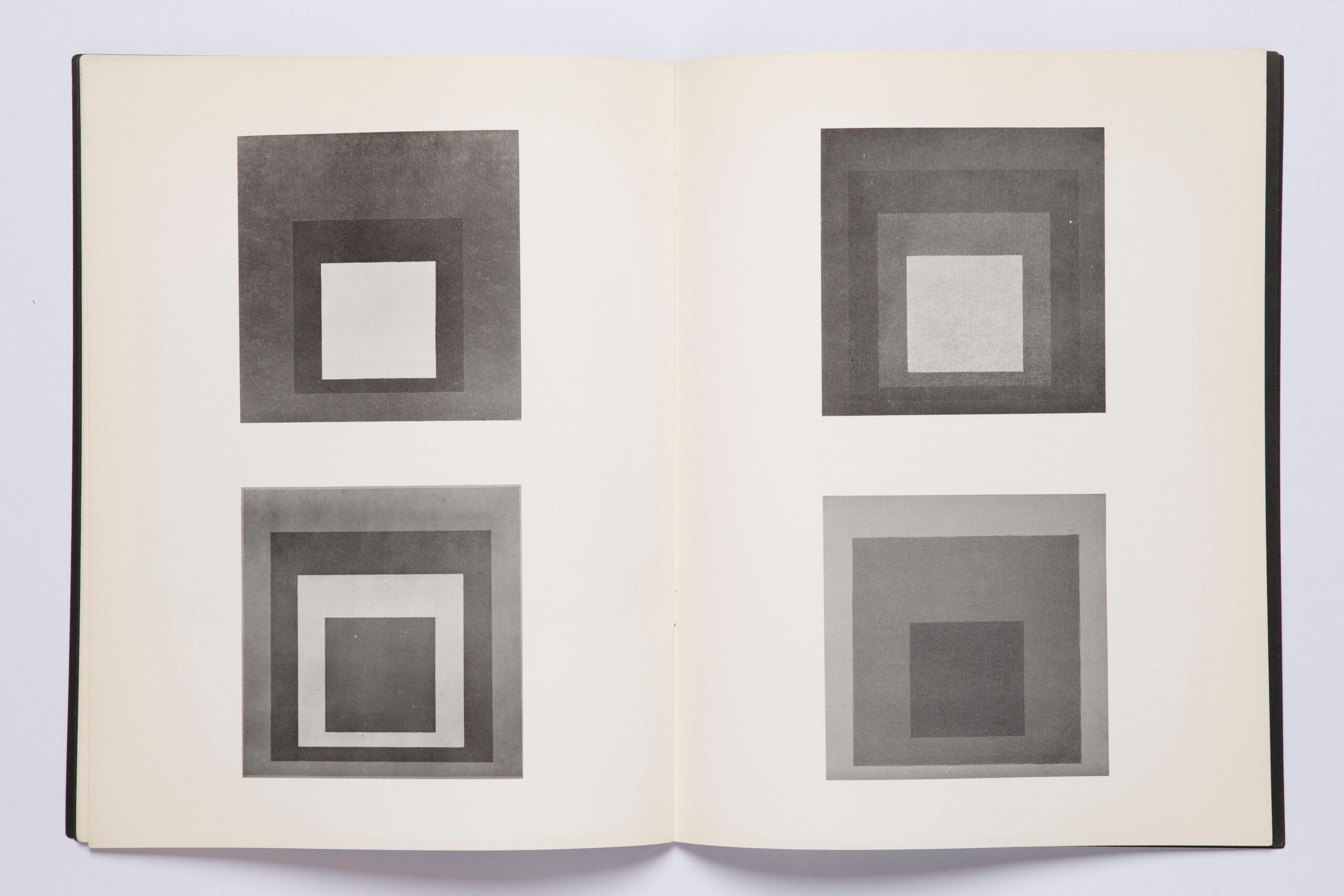
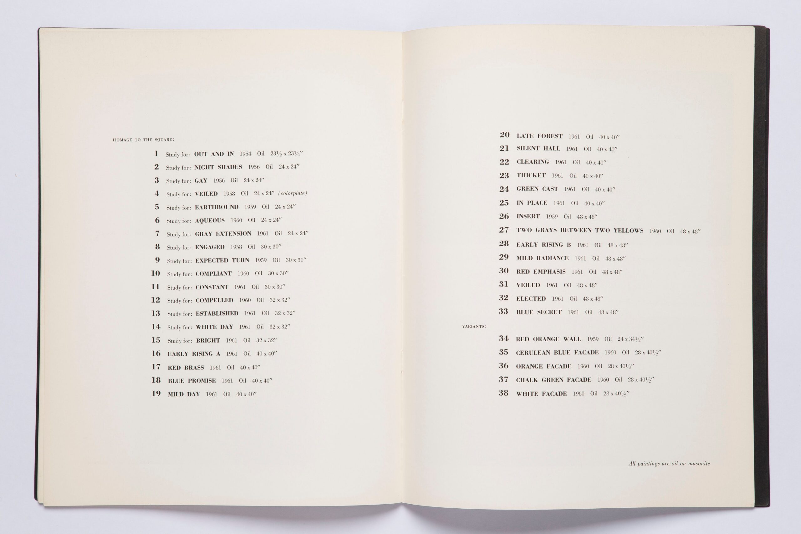
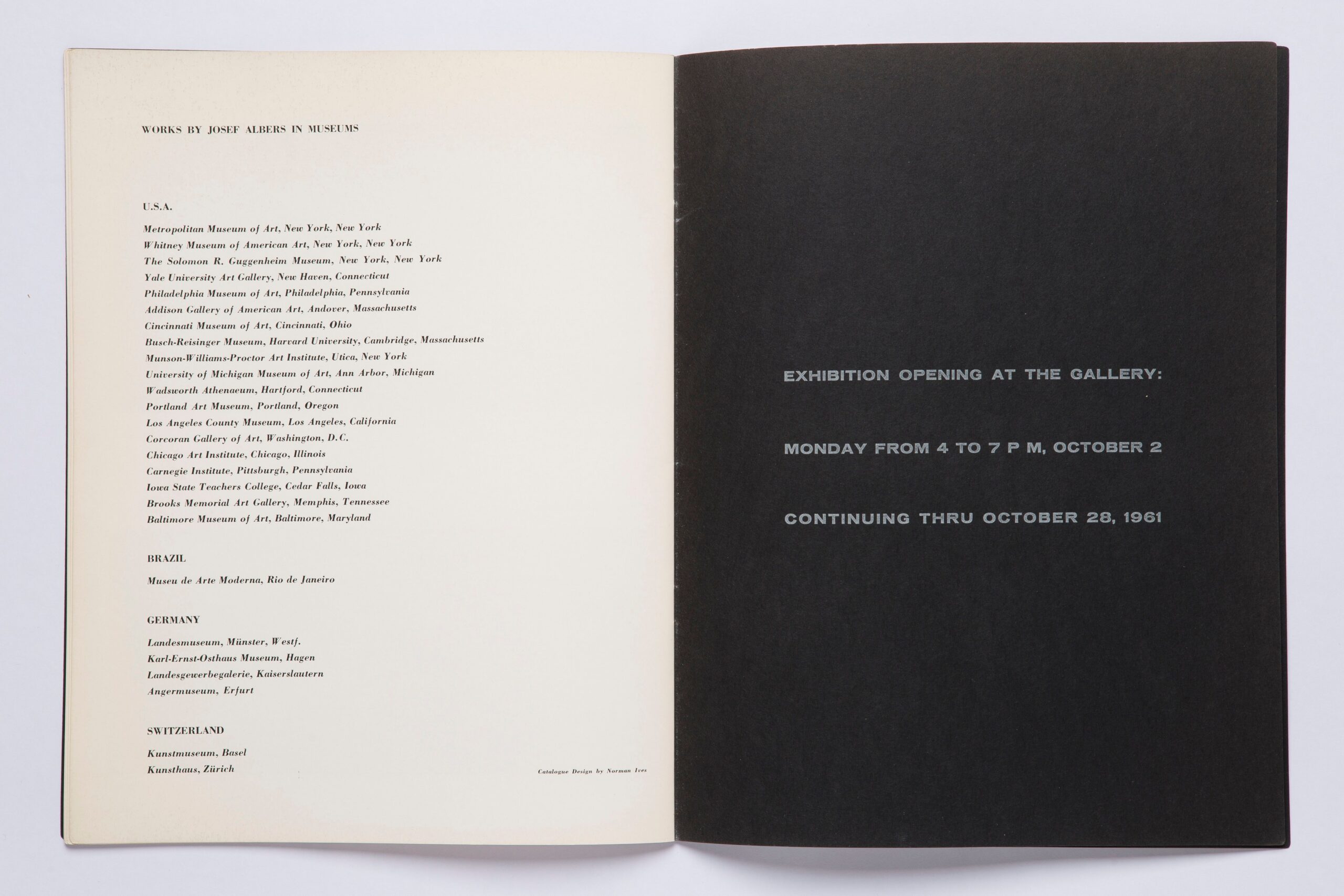
This catalogue was published to accompany an exhibition of Josef Albers’ work at the Sidney Janis Gallery in New York in October 1961. The catalogue lists 33 works from ‘Homage to the Square’ plus 5 variants.
Catalogue design by Norman Ives, who was deeply involved in many of Albers’ later publications featuring screen-printed plates.
The catalogue begins with a remarkable text: “Since colour in Albers’ paintings too frequently misleads the camera, the black and white plates in the catalogue do not adequately represent the actual painting. These reproductions, therefore, remain unnumbered and are included mainly to demonstrate the artist’s instrumentation of light and colour within a restricted order of design.”
This catalogue therefore does not aim to show the perfect reproduction (which was technically unfeasible in 1961) but presents a translation of the work. The catalogue reveals an aspect of the work; in a different way than in the exhibition itself. This makes you look at the work in a different way.
Since it has become technically possible to present the perfect reproduction in print, the emphasis has shifted to this, and there is less focus on the question of how a work can be translated for the specific medium of the book.
This makes this book particularly relevant to me today.
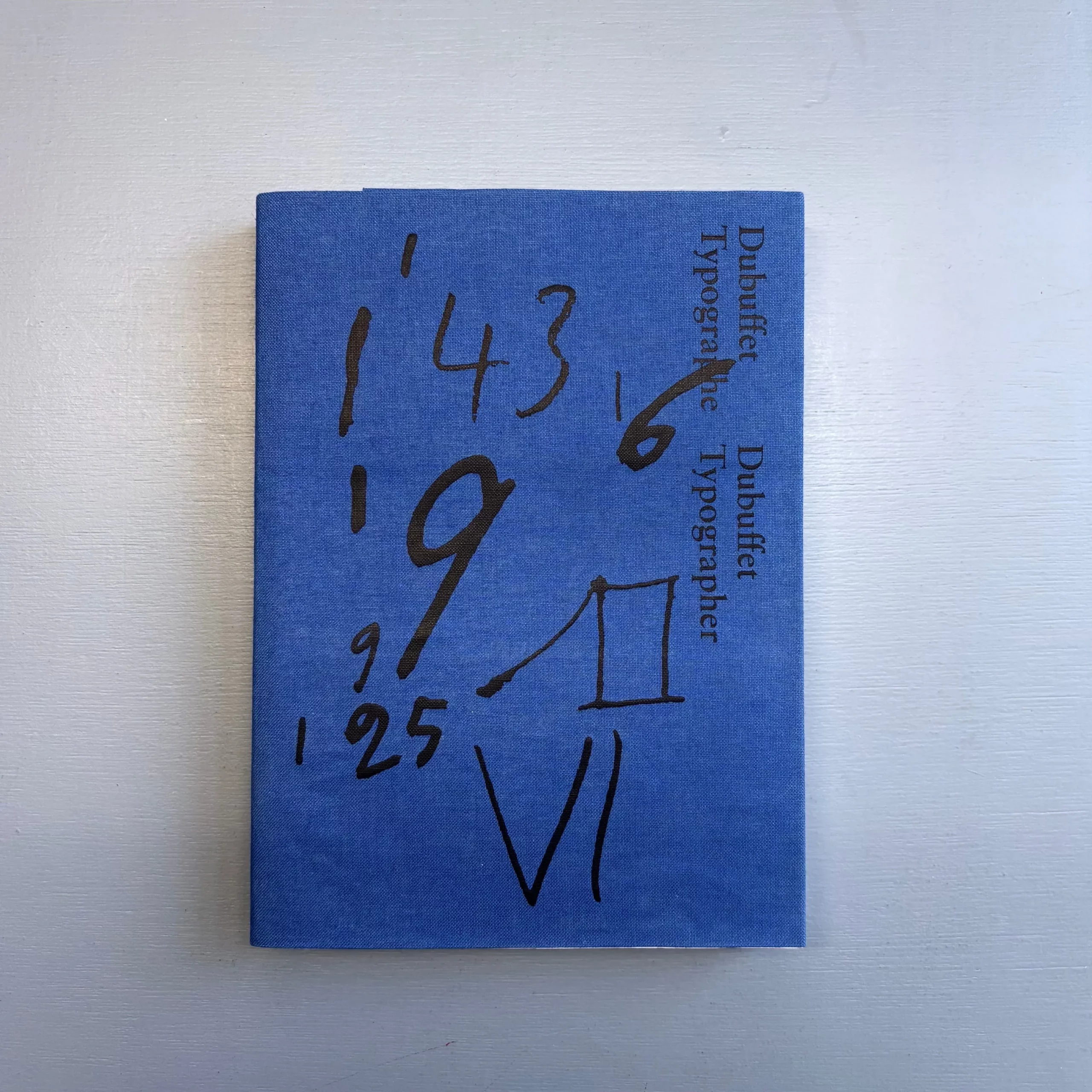
64p – FR/EN – 21 x 14,5 cm – softcover
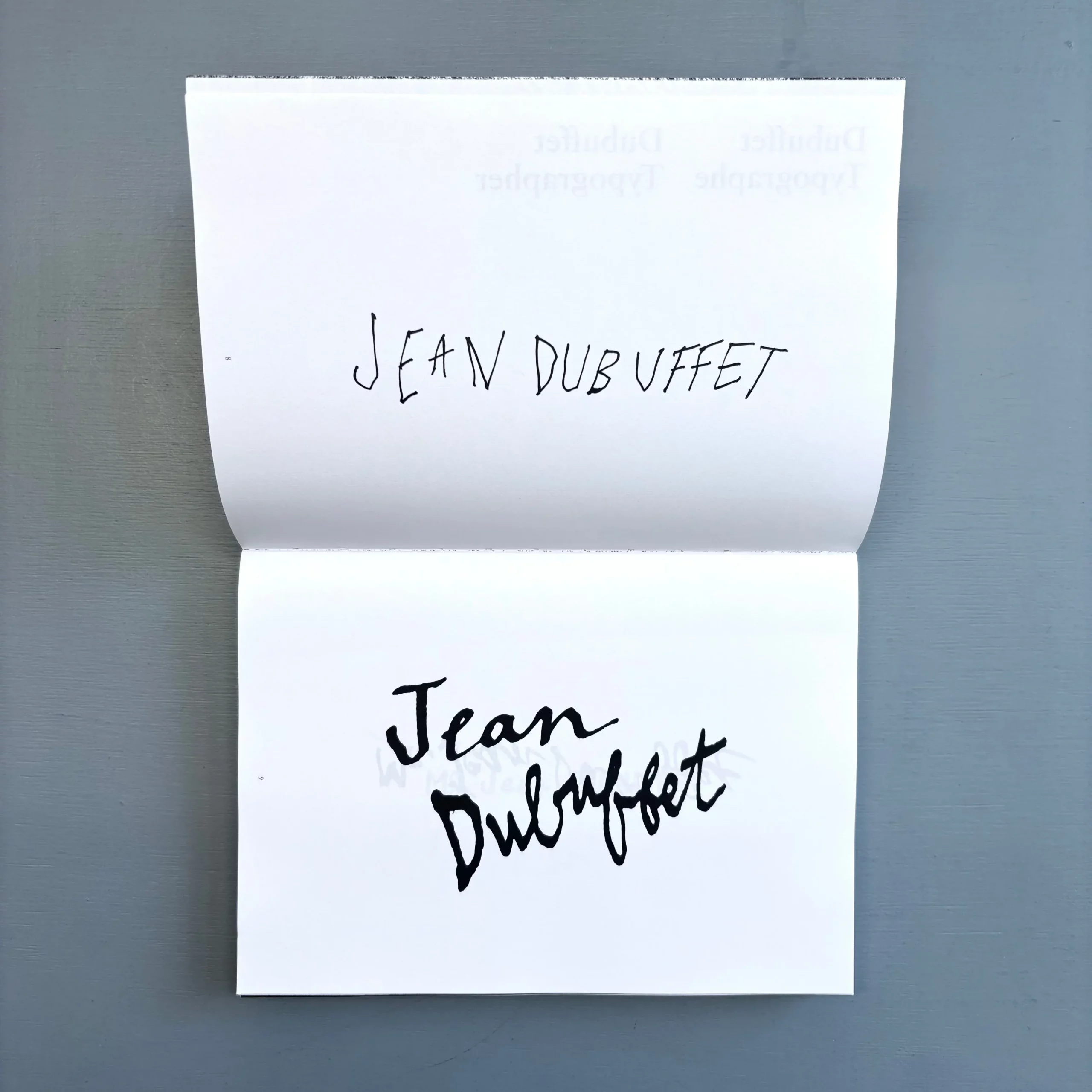
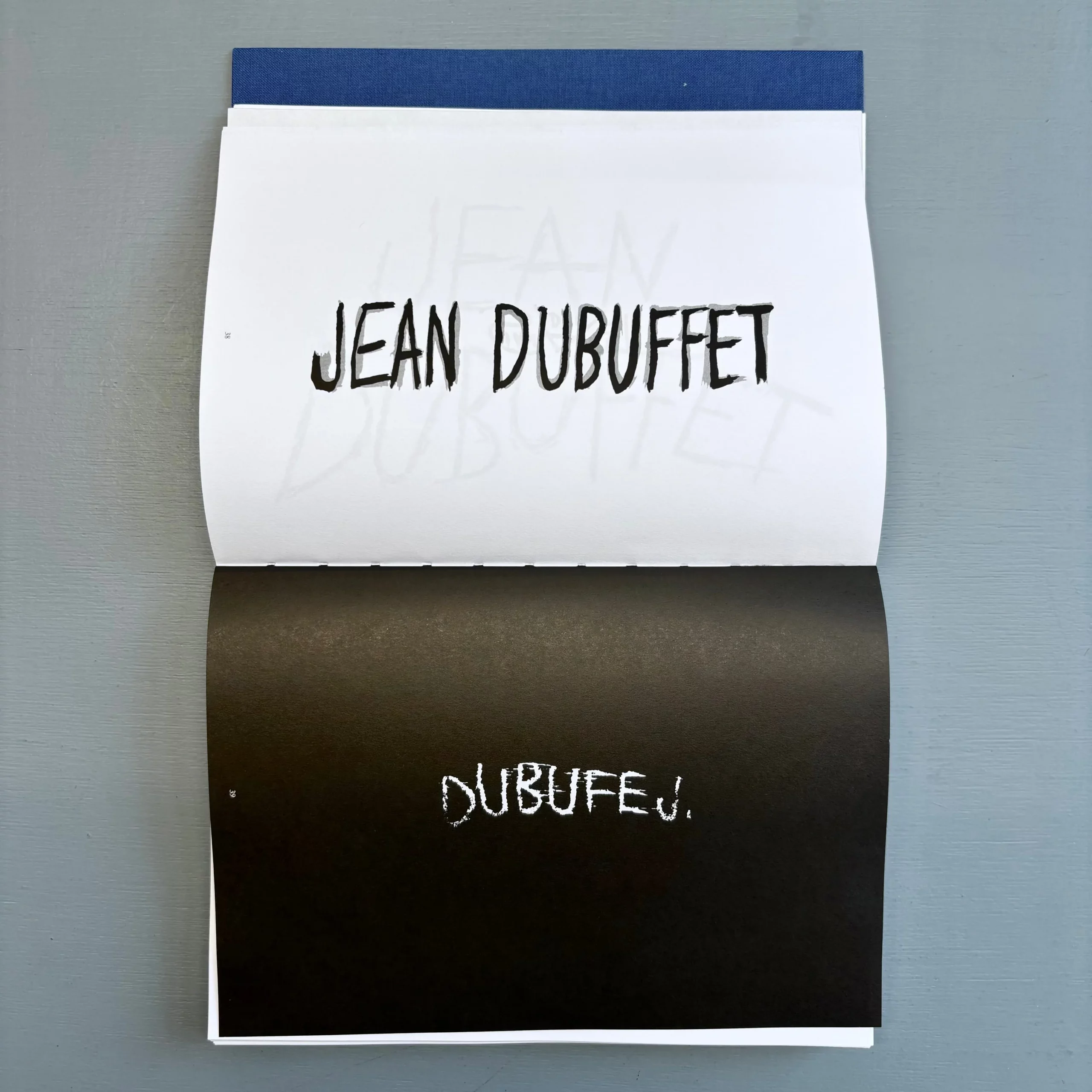
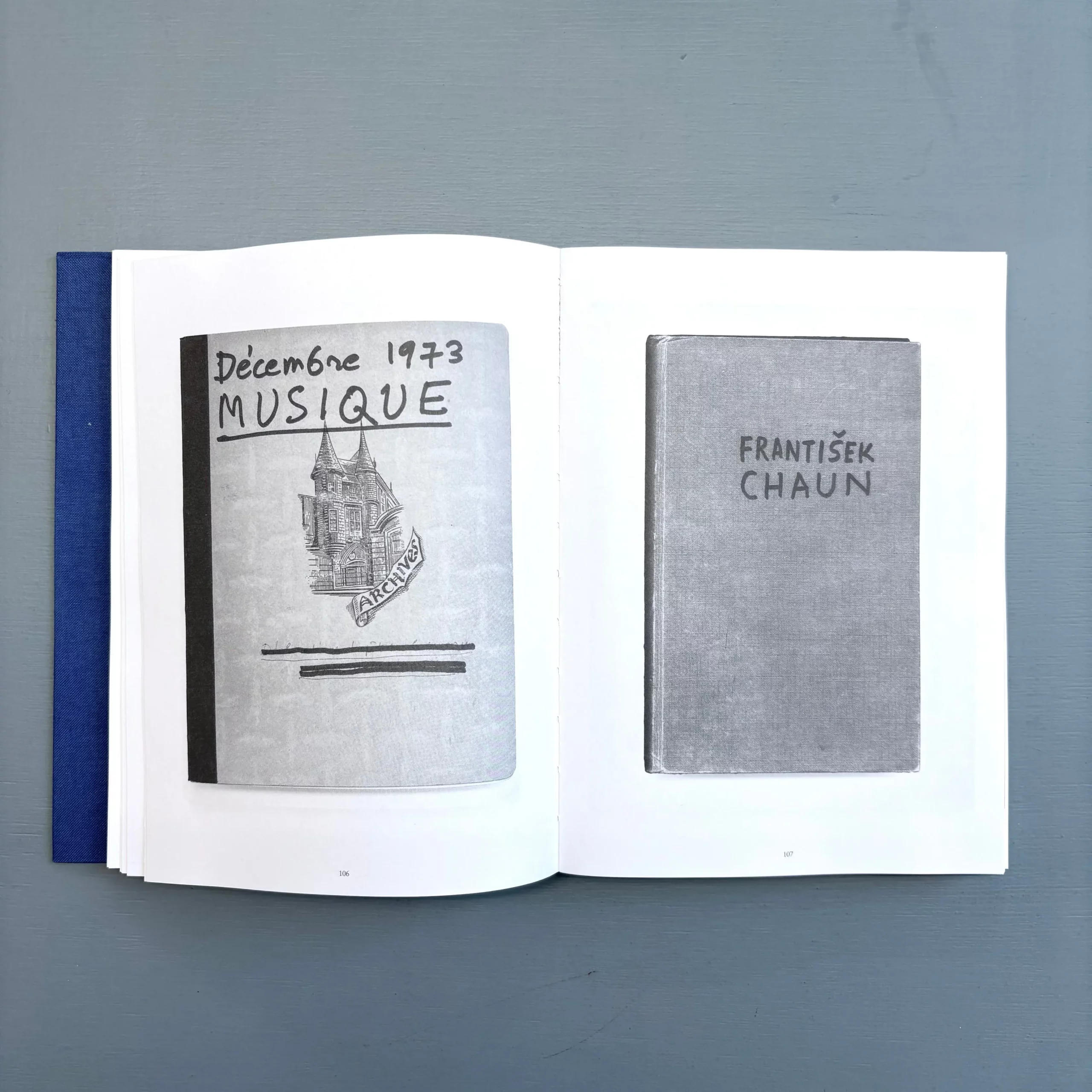
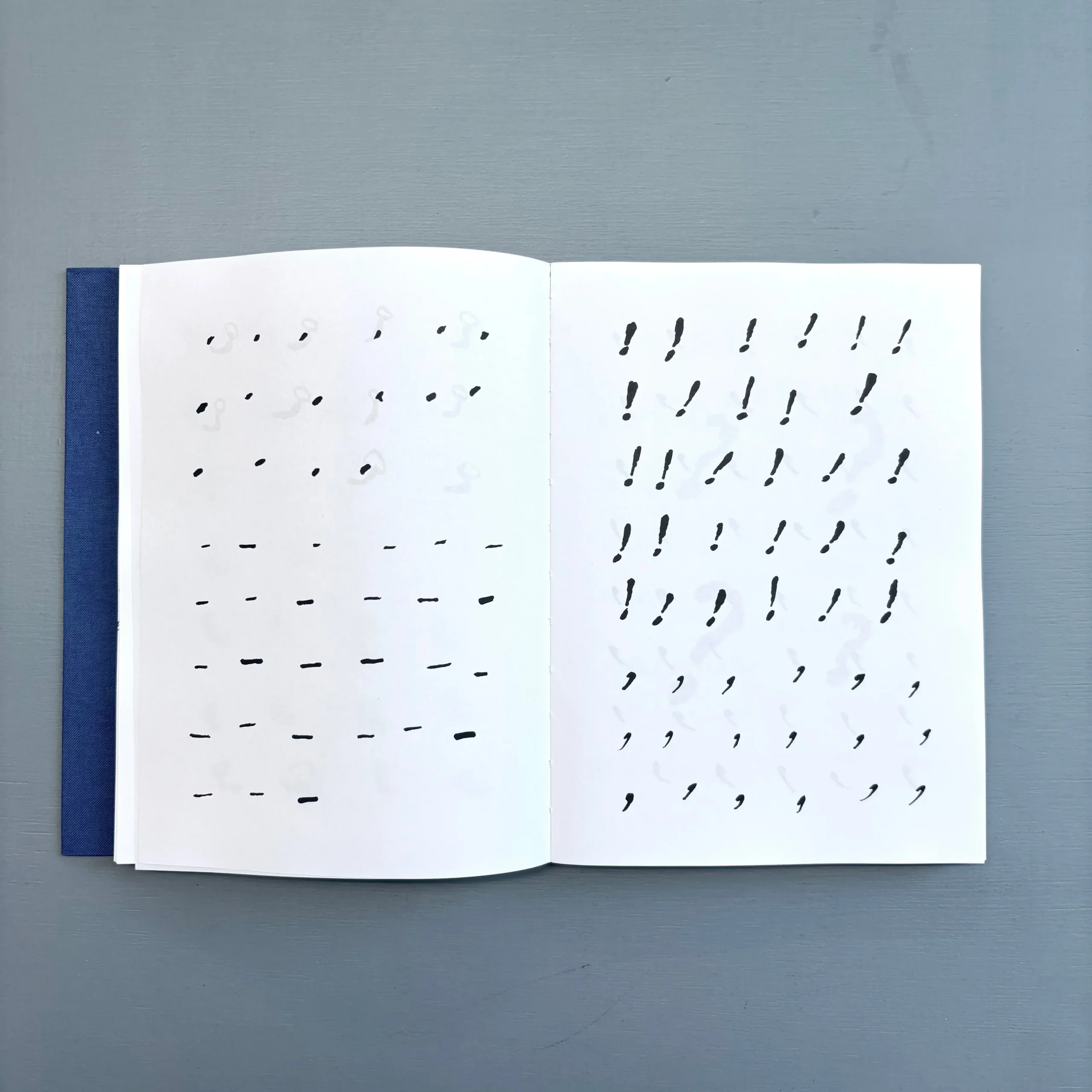
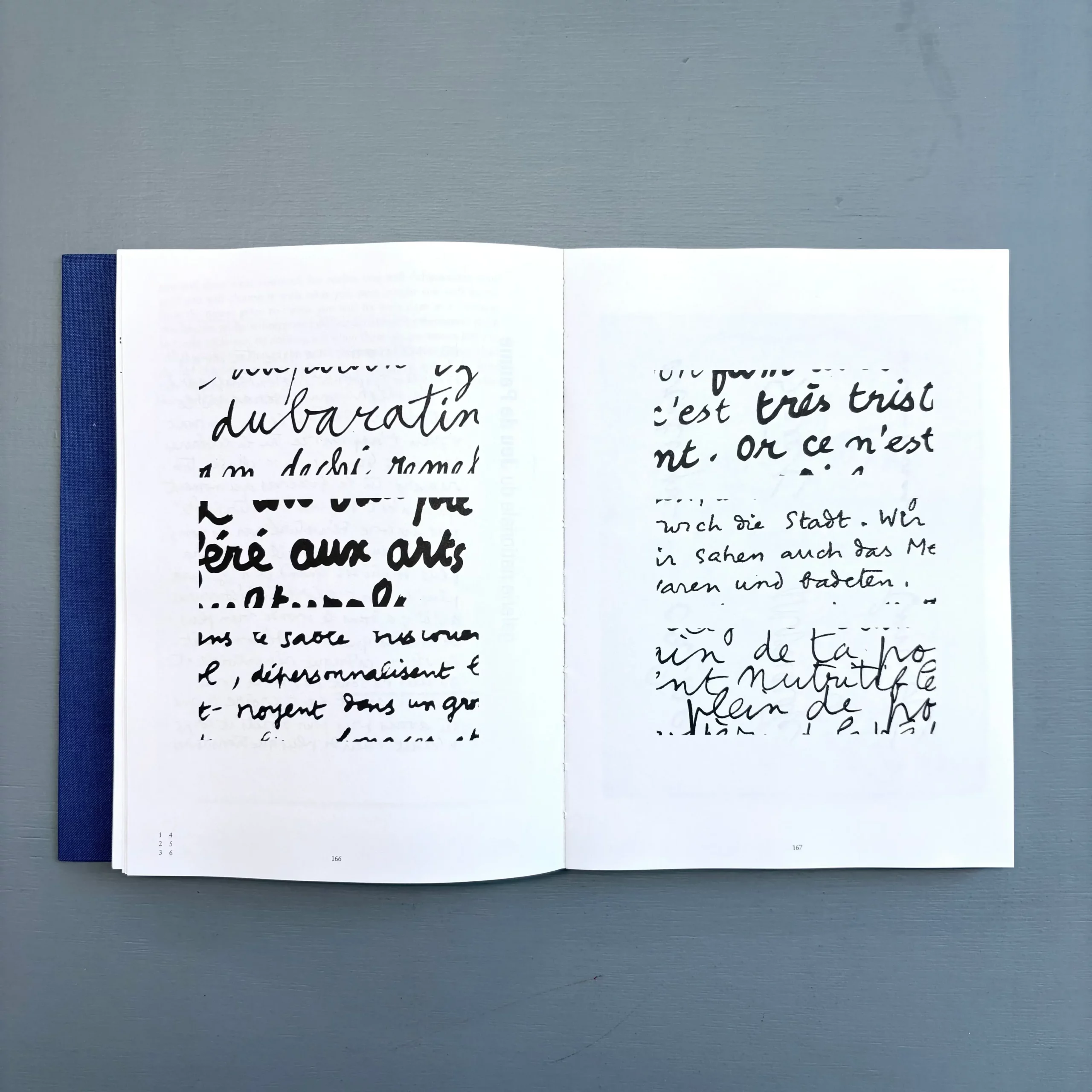
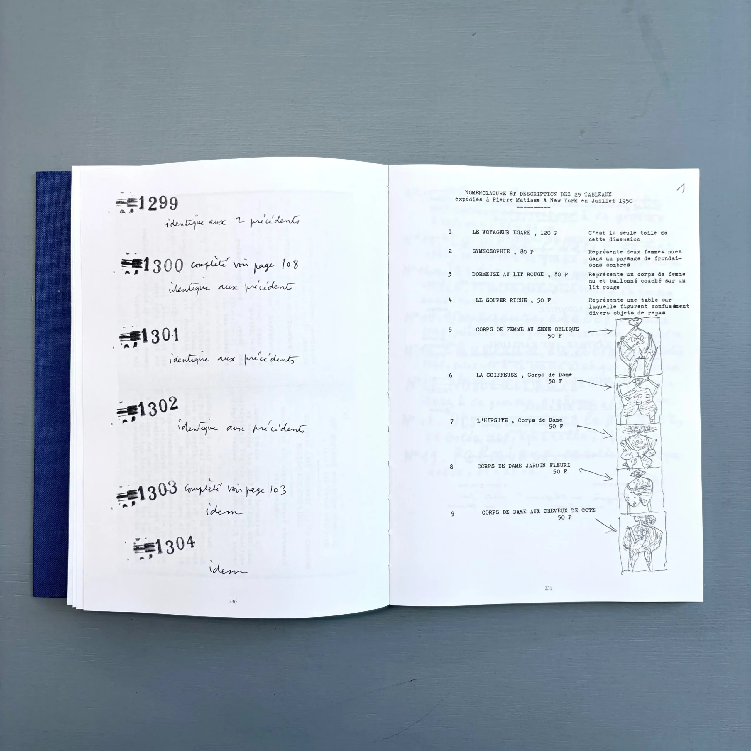
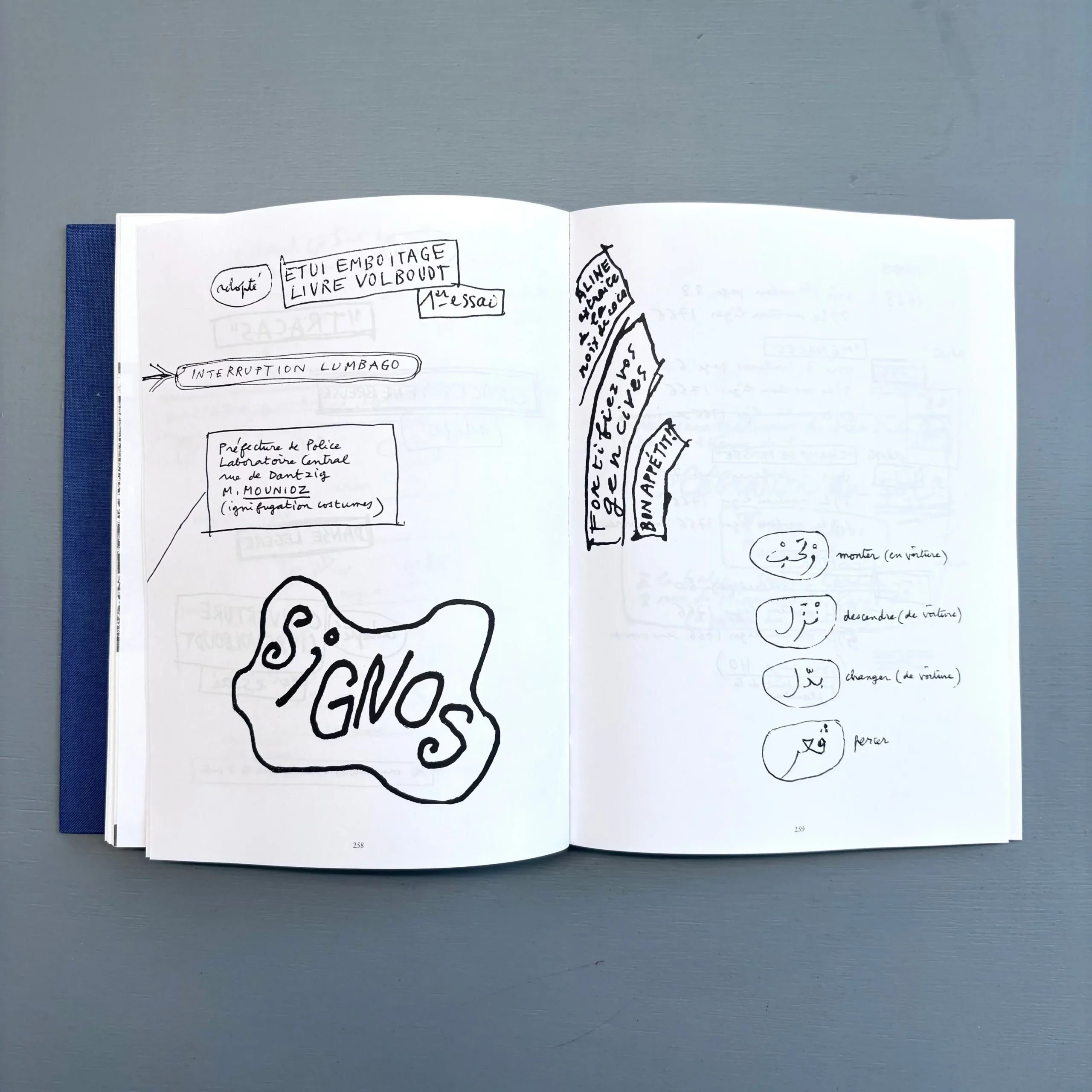
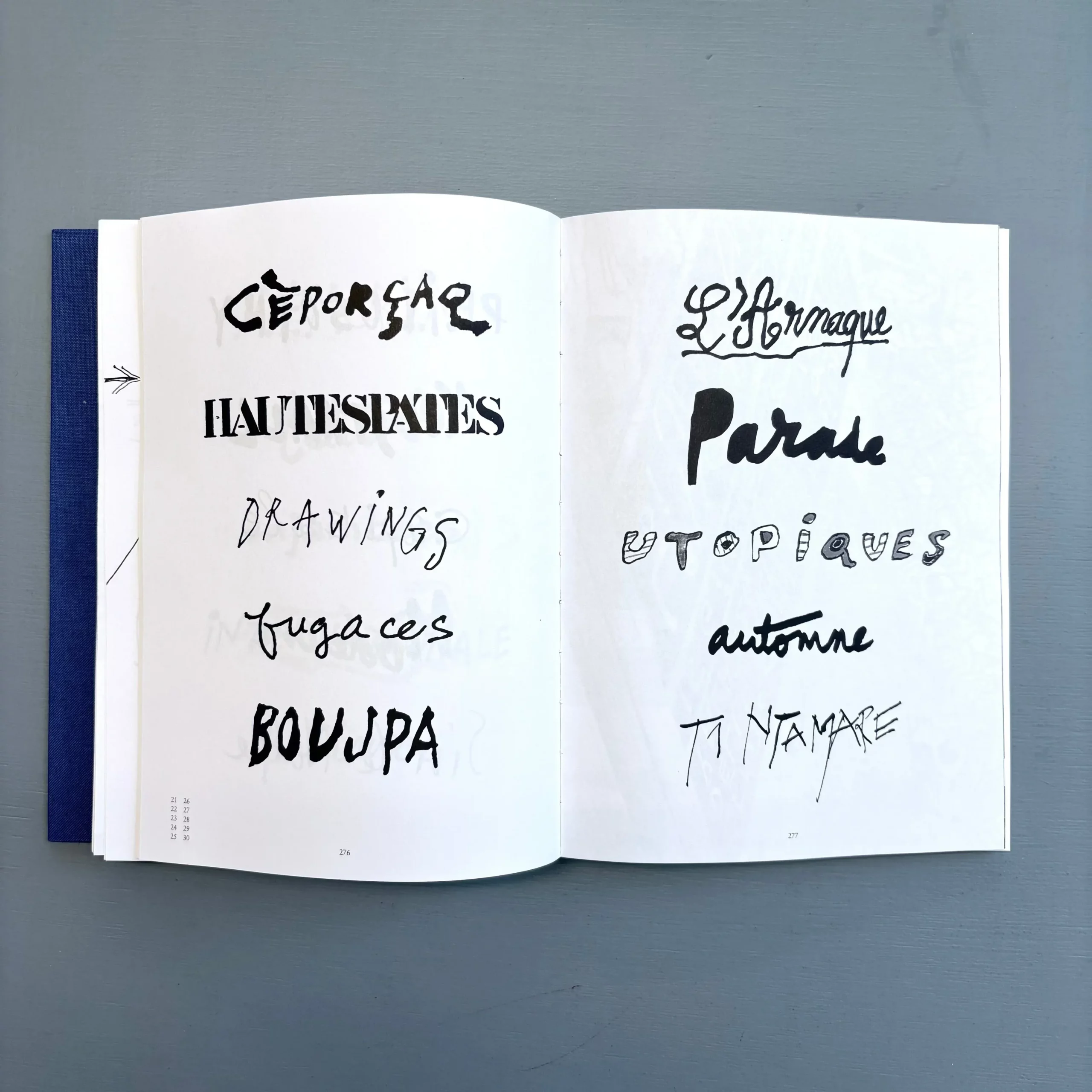
A tribute to the French artist Jean Dubuffet (1901–1985) and to the typographic strategies with which Dubuffet achieves, on a visual level, his plan to destroy language through books and lithographs.
Dubuffet Typographe/r investigates the former wine-dealer's professional acumen, demonstrated by Dubuffet's creation of Art Brut and culminating in the management of an entire staff working to promote, document, and archive his activities. In the light of today's obsession with self-promotion, Dubuffet can be understood as a forerunner of artists such as Jeff Koons or Damien Hirst. Once again, Leguillon's approach follows seemingly marginal paths, which ultimately prove to be unexpectedly revelatory. Travelling to public and private archives such as la Fondation Dubuffet in Paris, the Bibliothèque Kandinsky at Centre Pompidou or to IMEC in Caen, Leguillon has photographed ephemera such as invitations, posters, catalogs, artist's books, flyers, tickets, and record sleeves. These images were then used to execute a “recadrage“ (re-framing) of Jean Dubuffet and his activities. Like a meticulous “detective,“ Leguillon shows us how “for each project, Dubuffet invented a new way of writing and composing text—quite possibly by simply improvising. By this, he rejected the standardization as imposed by the printing process and typing, an education he himself went through. In books and lithographs, Dubuffet thoroughly sabotaged writing and typography (l'écriture) by fragmenting and distorting it, thus achieving, on a visual level, his plan to destroy language.”
Published as a part of the second project of Pierre Leguillon for the 2013 Carnegie International.
Pierre Leguillon (born 1969 in Nogent-sur-Marne, France, lives and works in Paris) is an artist, curator, and writer.
This book highlights one aspect of Dubuffet. It once again demonstrates how a particular aspect of an artist’s work can be better showcased in a book than in an exhibition.
Daniel Buren. Discordance/Cohérence, Published by Van Abbemuseum, Eindhoven, Designed by Walter Nikkels, 1976
80 pp. (b/w ill.), 21 × 27 cm, English/French
“A book by R.H. Fuchs with the collaboration of Daniel Buren and with contributions by André Bompard, B.H.D. Buchloh, Douglas Crimp, René Denizot.
All descriptions (photographs+texts+diagrams) here included correspond with works selected by Rudi Fuchs. This selection represents approximately seven percent of the work executed since 1965. Most descriptions are being done here for the first time. All descriptions have been written (or rewritten) especially for this book.
Walter Nikkels’ work should not be underestimated. This catalogue is structured around a clear concept; yet every spread is different and a delight to see.
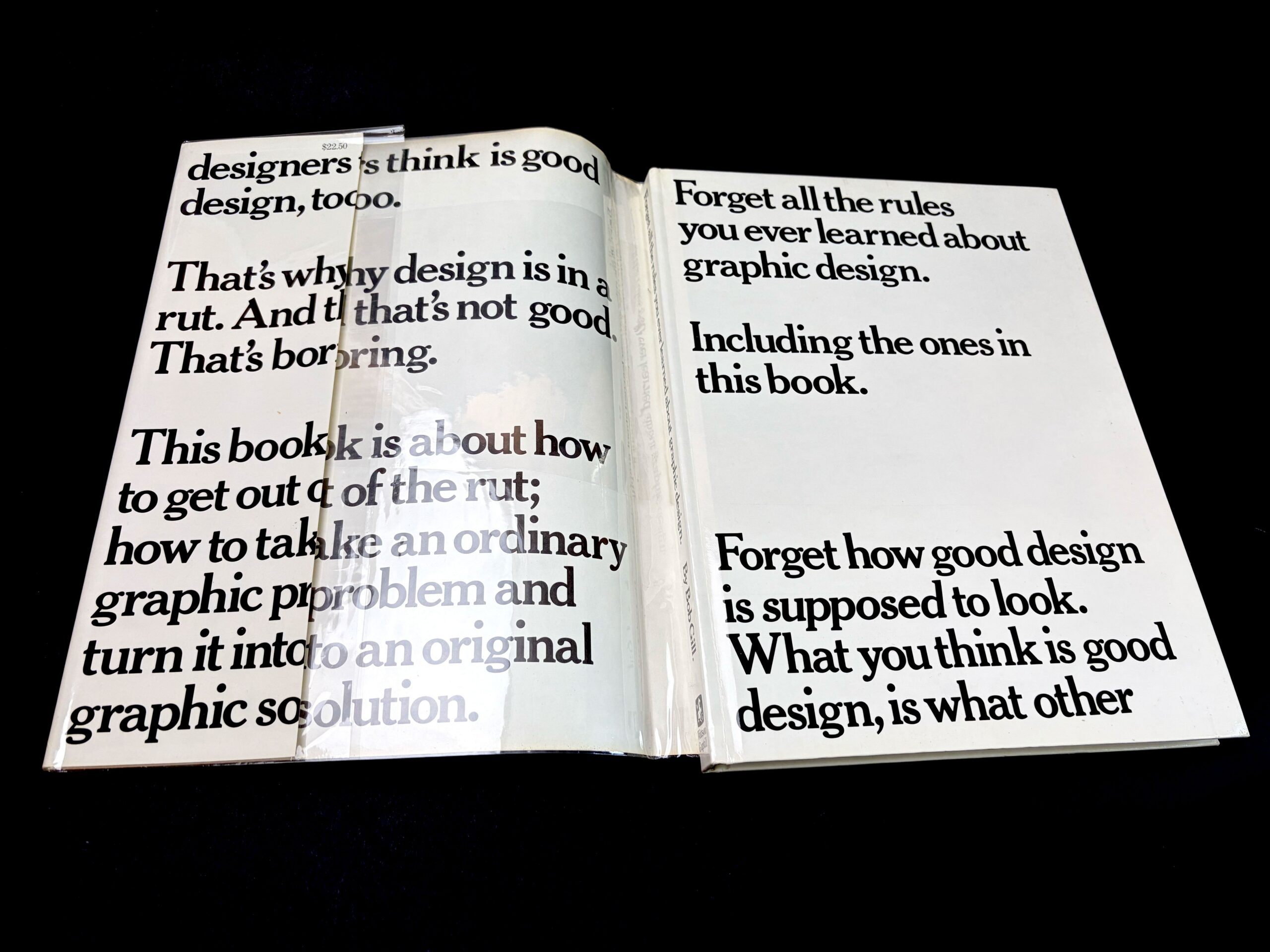
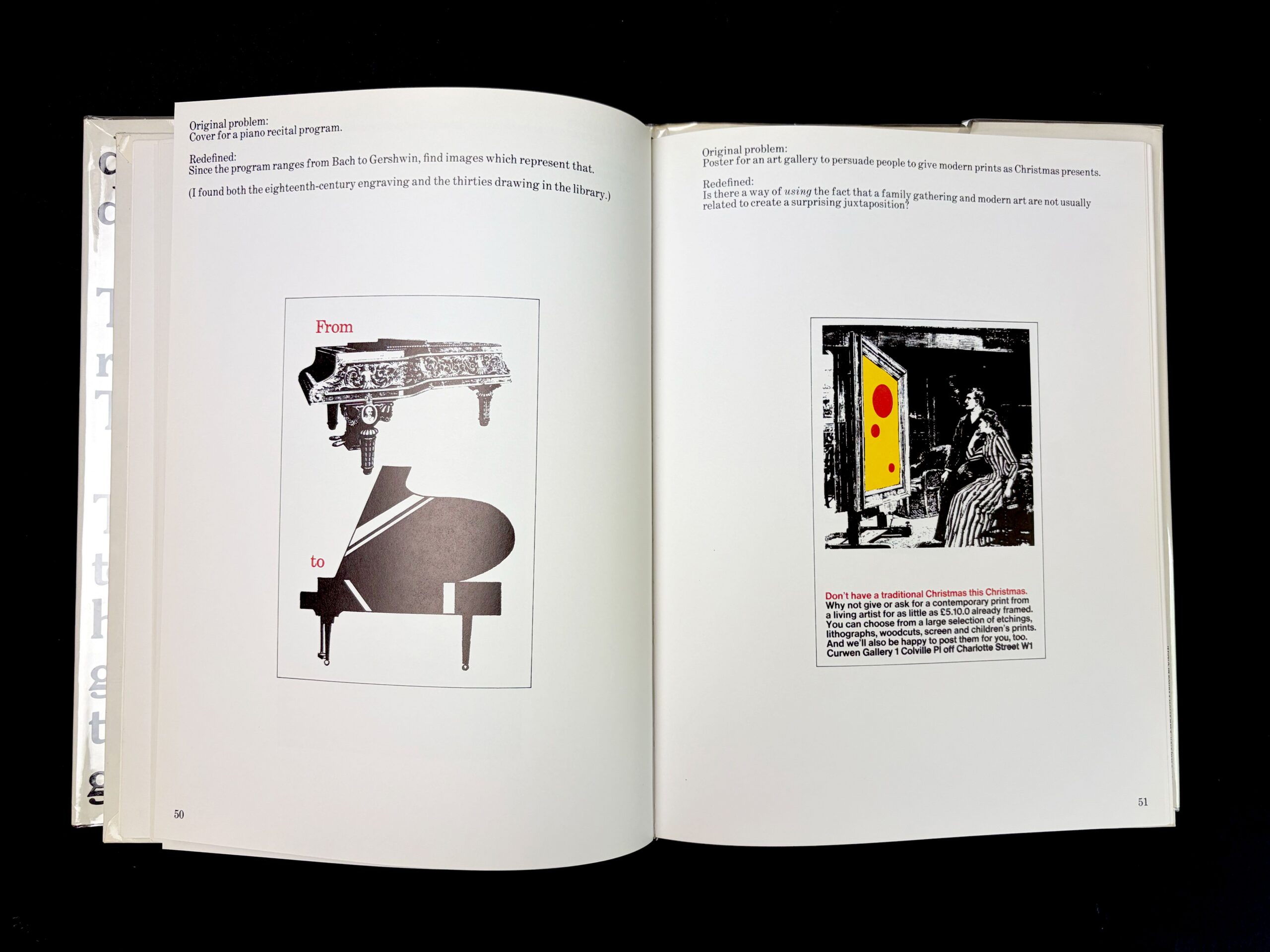
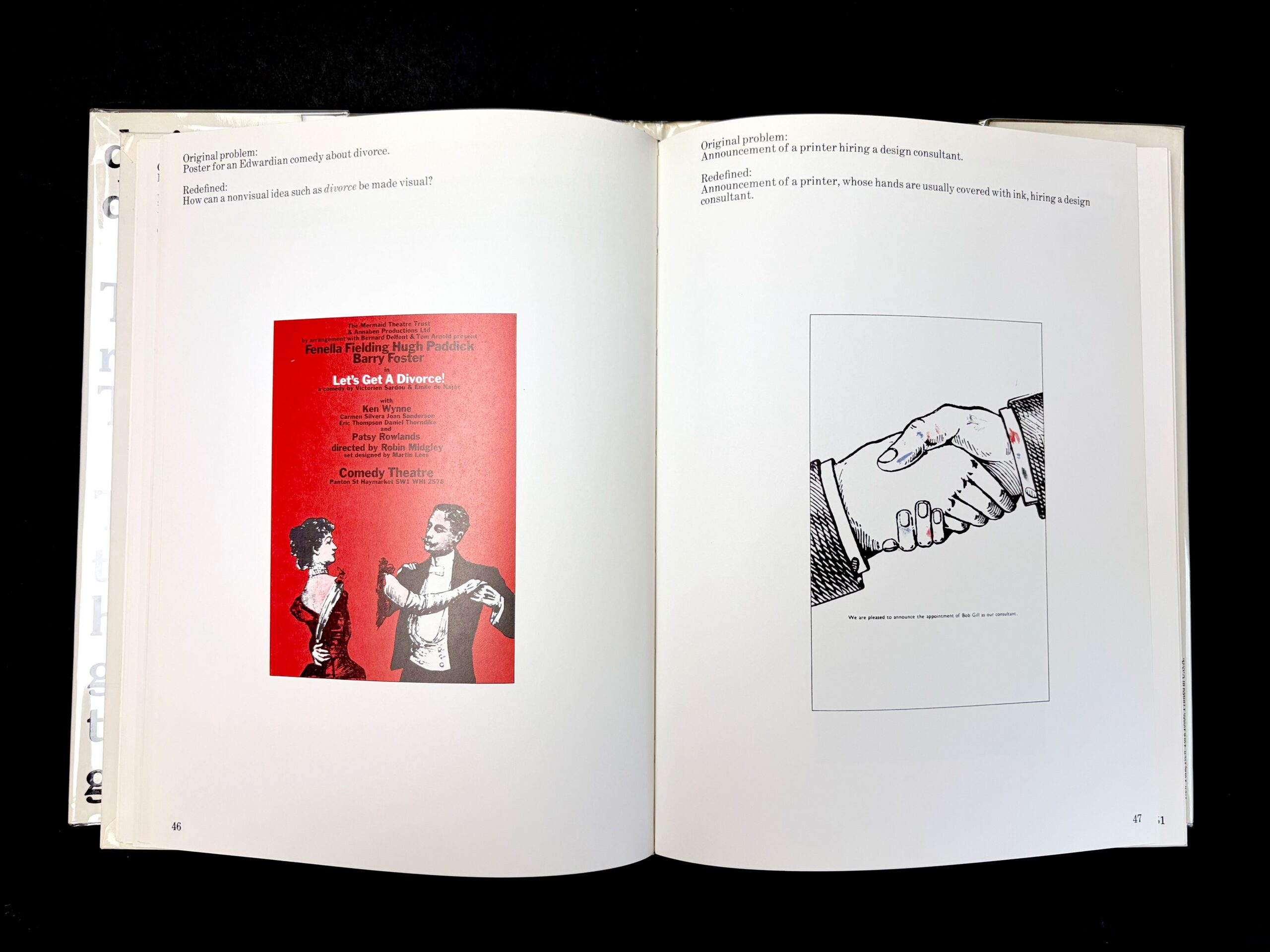
"This book is about ordinary graphic problems and how the problems themselves can lead to surprising, original graphic solutions. Provided the designer is prepared to let go of any preconceptions about how design is supposed to look", Bob Gill.
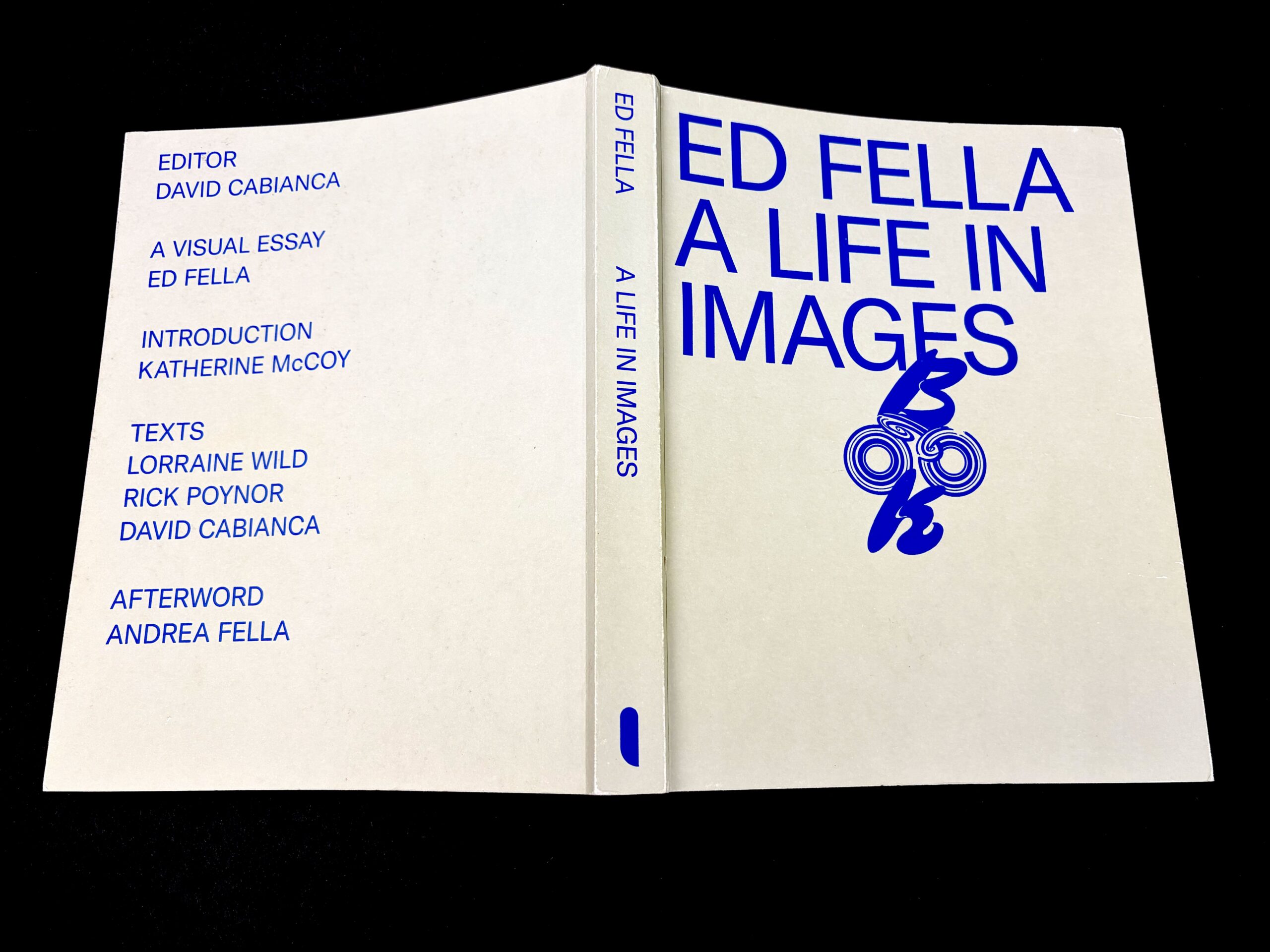
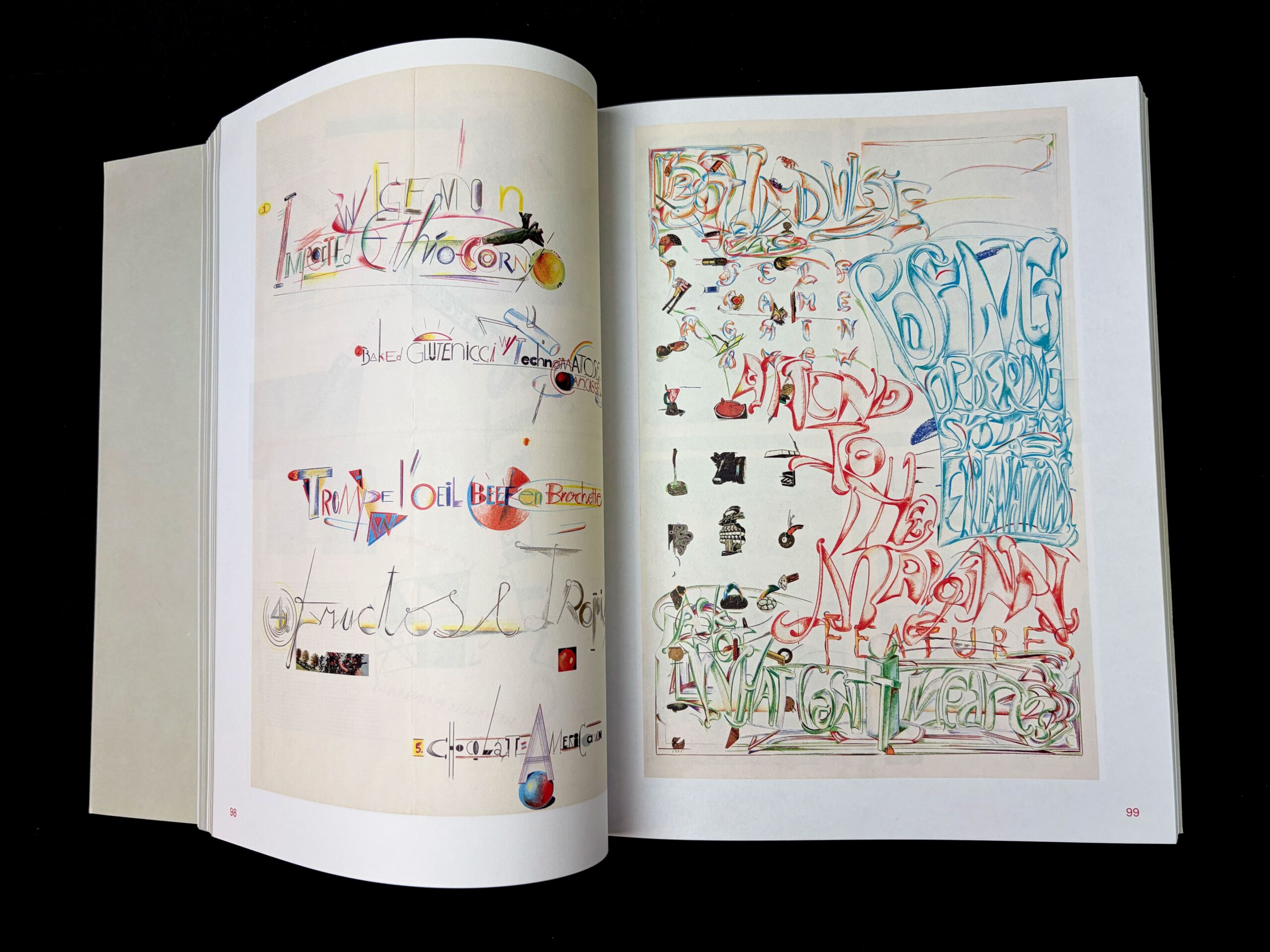
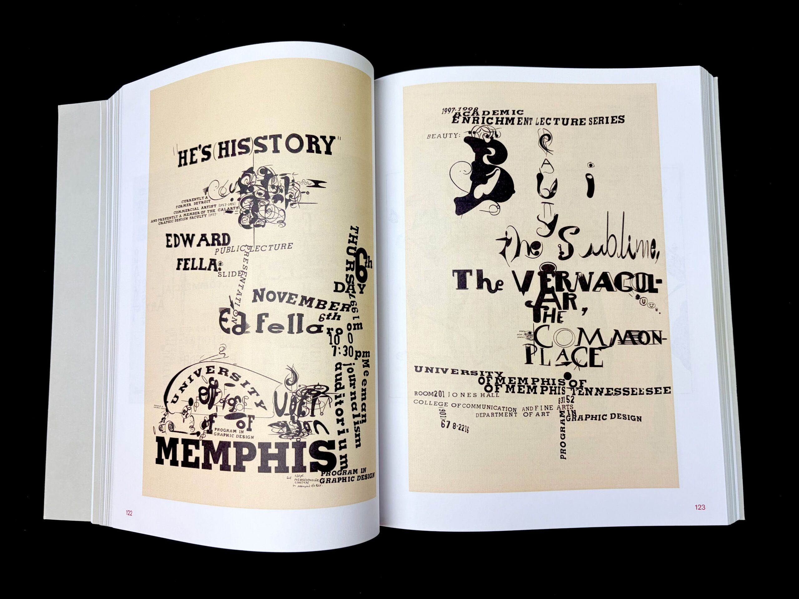
Ed Fella: A Life in Images,Ed Fella, Editor: David Cabianca, Visual Essay: Ed Fella with Andrea Fella Unit Editions, London, 2021.
Ed Fella: A Life in Images (Unit Editions), celebrates the life and work of a great designer, artist and educator.
The book’s beating heart is a 316-page visual essay that contains uncaptioned selections from 60 years of work – flyers, posters, original sketches, drawings, photographs and collages. It divides almost equally between what Fella calls his ‘two careers’: first, his 30 years as a commercial artist in Detroit; second, his life as an ‘exit-level’ designer, teaching at CalArts in Santa Clarita, California, where he still has a studio. The visual essay was sequenced and art directed by Ed Fella with his daughter Andrea Fella, who contributes an afterword about their work in his big archive.
In a digital age, Fella remains fully committed to the power of the hand-drawn and at 84 he is still pushing boundaries, living a life outside the lines, freed from the tyranny of the grid.
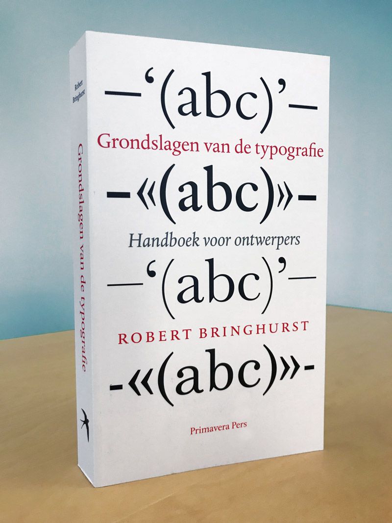
Grondslagen van de typografie/The Elements of Typographic Style, Robert Bringhurst, 1992
Grondslagen van de typografie is a translation of Robert Bringhurst’s international bestseller The Elements of Typographic Style (version 4.1). A book for both professional designers and anyone involved in typesetting who has an interest in typography.
The renowned German typographer Hermann Zapf described Bringhurst’s book as “a must for everybody in the graphic arts” and concluded, “all desktop typographers should study this book; I wish to see this book become the Typographers’ Bible”.
The Canadian Robert Bringhurst is one of the world’s most respected typographers. He is also renowned as a poet. Bringhurst has taught the history of typography at various universities and is a fellow of the Canada Council for the Arts, the American Philosophical Society and the Guggenheim Foundation.
For this translation, Dutch type designers Martin Majoor and Frank Blokland each wrote a foreword. The book was designed by the Arnhem-based designer and graphic artist Titus Schulz. The text is set in DTL Albertina, designed by Chris Brand and digitised by Frank Blokland of the Dutch Type Library.
For a long time, typography was the exclusive domain of the craftsman. However, the computer has brought about a definitive change in this – nowadays, everyone is a ‘designer’. Bringhurst’s book is closely attuned to this development and thus meets a clear need. It is a reliable handbook that offers a history of the art of typography and provides an overview of symbols, concepts and traditions.
Bringhurst masterfully bridges modern technology and the age-old craft. When The Elements of Typographic Style was published in 1992, the book was immediately embraced by both conservatives and members of the avant-garde. It quickly became a standard reference work, which is now finally available in Dutch.
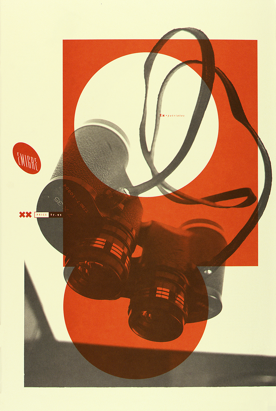
Emigre Magazine
1984-2005
Produced, edited, and designed by Rudy VanderLans and typeset by Zuzana Licko using a Macintosh computer, Emigre pioneered desktop publishing and set the standard for the first digitally designed layouts and typeface designs. At the time, its use of experimentation and disregard for conventions followed by then-prevalent modernist designers made Emigre both a controversial and a highly influential voice in graphic design.
ALSO AVAILABLE AT THE LUCA SCHOOL OF ARTS GHENT LIBRARY
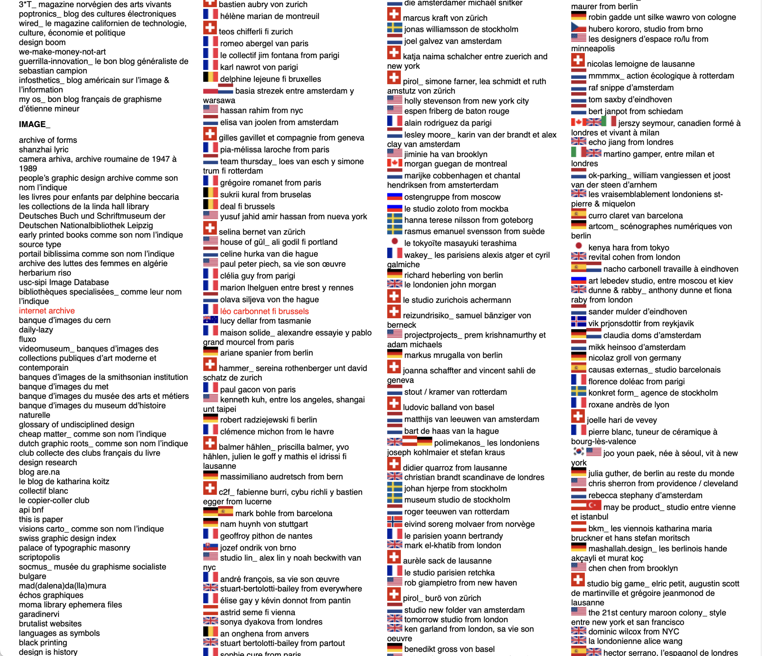
The largest online index of carefully selected designers / design agencies / typographers / artists etc., compiled by Thierry Chancogne (lecturer, theorist and writer on graphic design).
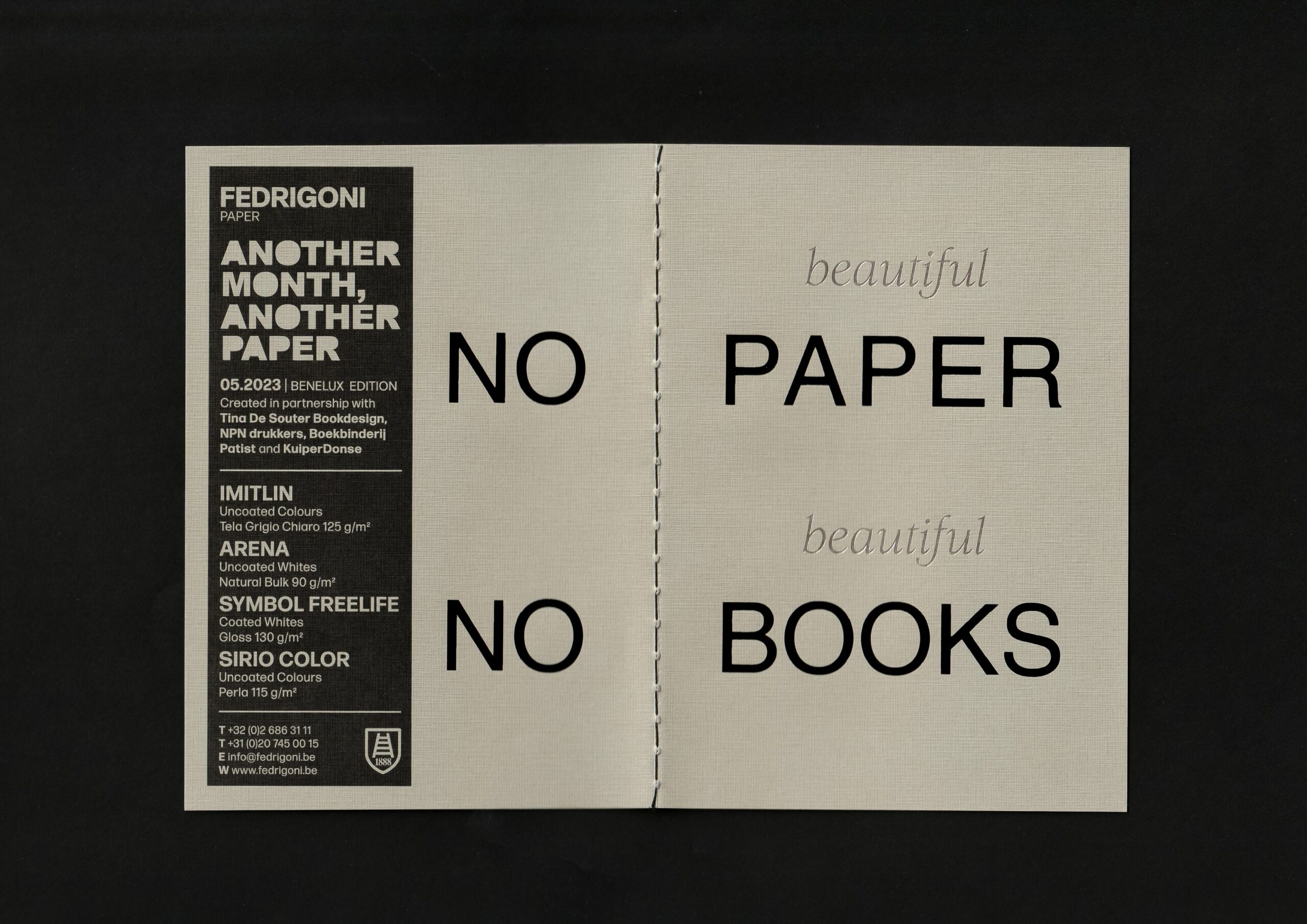
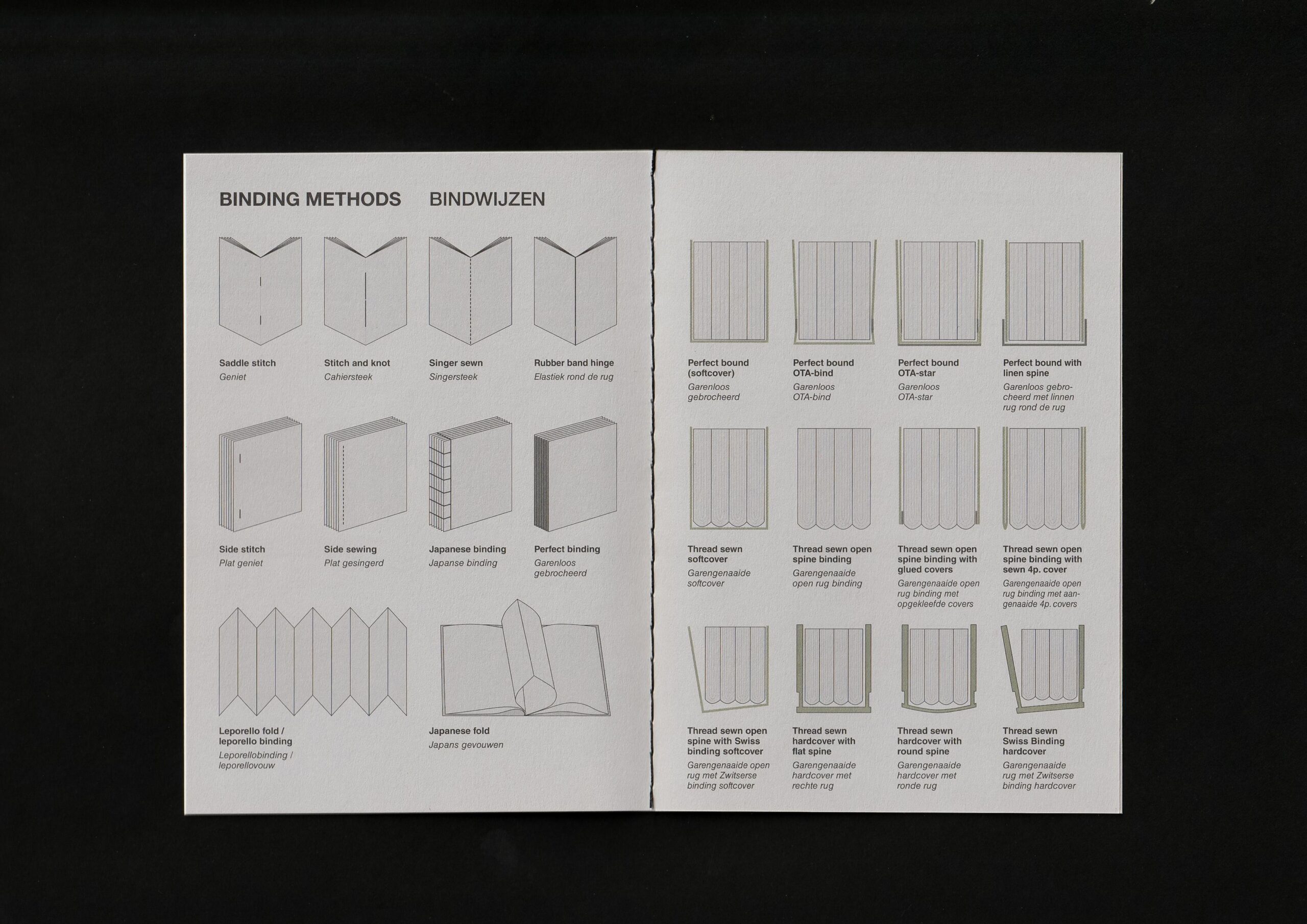
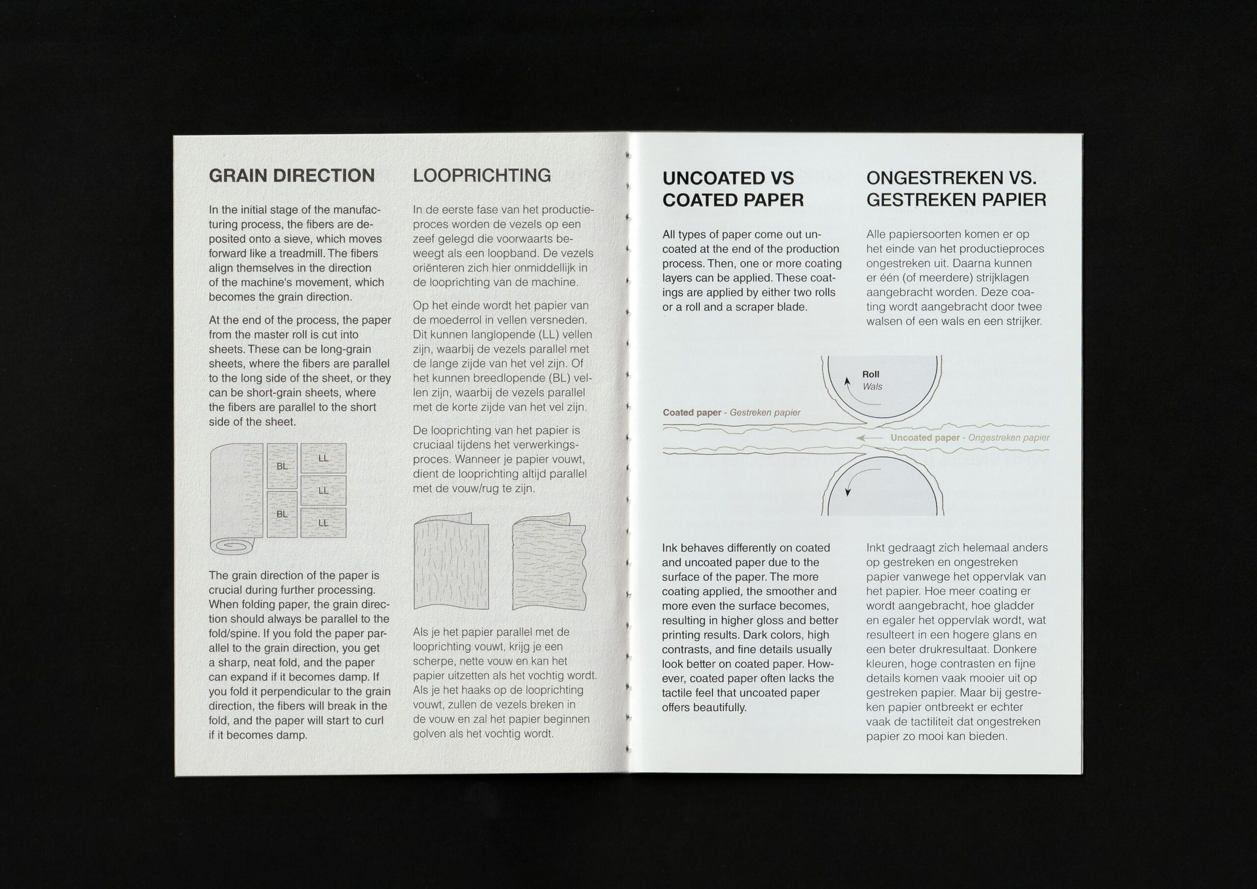
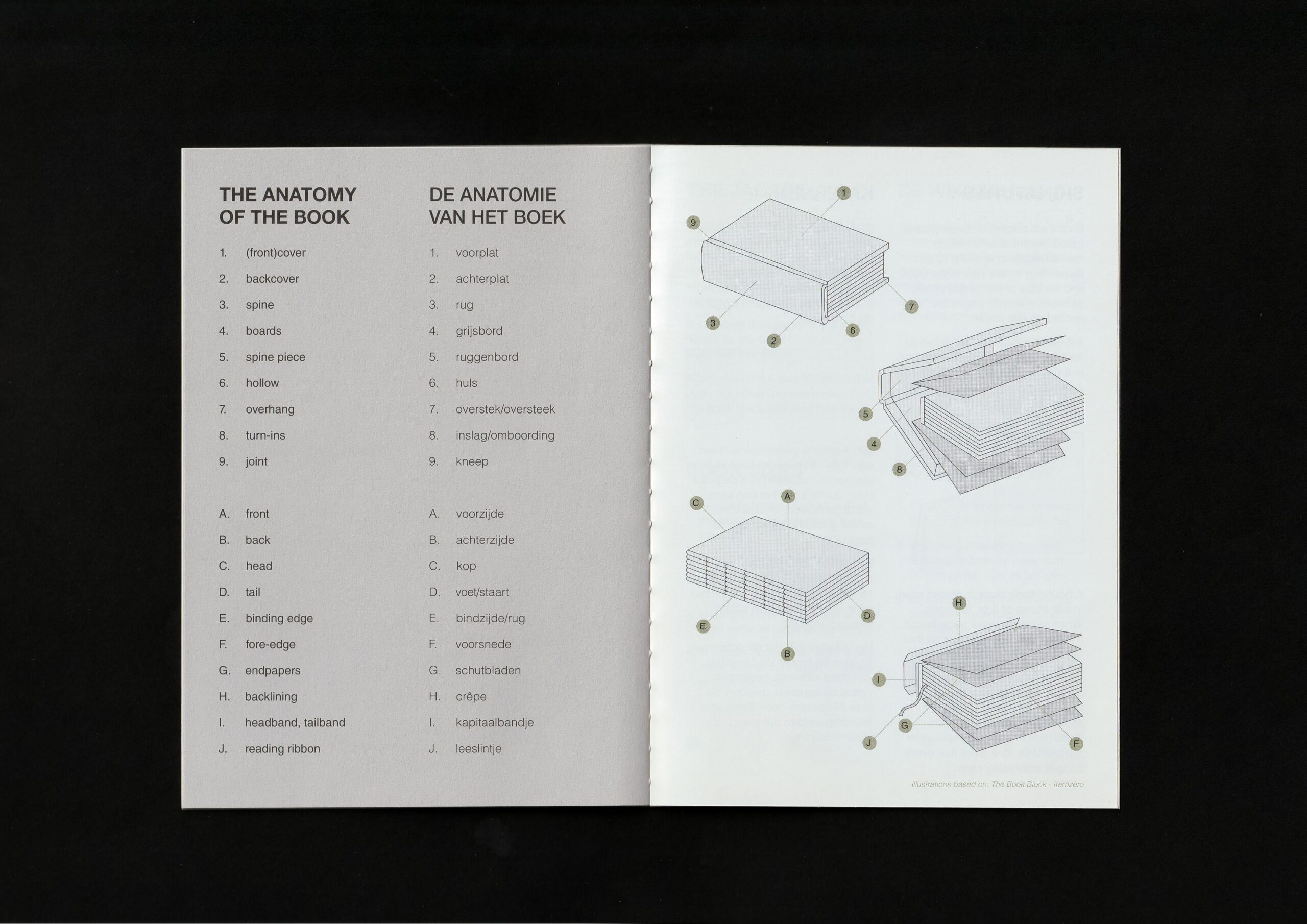
For the AMAP of Fedrigoni (Another Month Another Paper) I created a small booklet full of information on books and paper. It includes how paper is made, what different papers exist, how to use paper in books, the anatomy of books, binding methods, etc.
I call it 'a little bible on paper and books'.
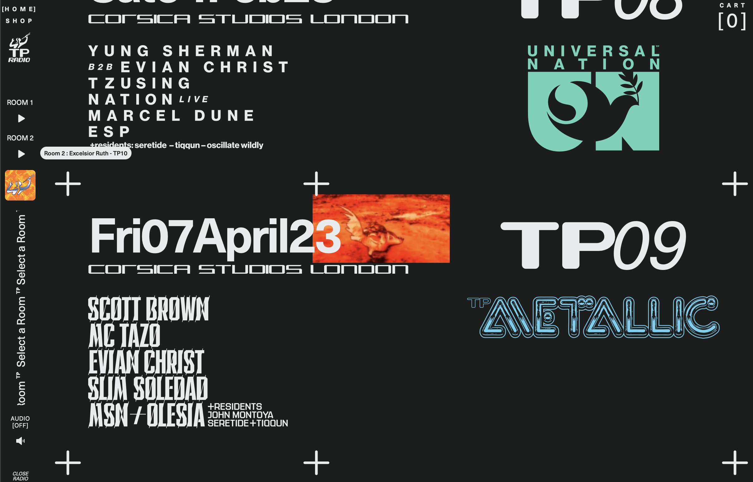
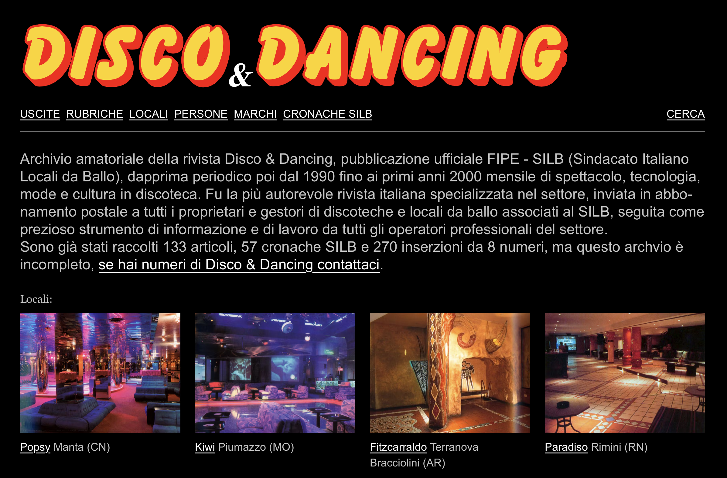
For me, architecture is closely related to graphic design. It is about the experience of space, much like how a poster should convey the essence of an event or its purpose. The architectural imagery of the 1980s Italo disco era truly sparks my imagination. It almost feels fictional.
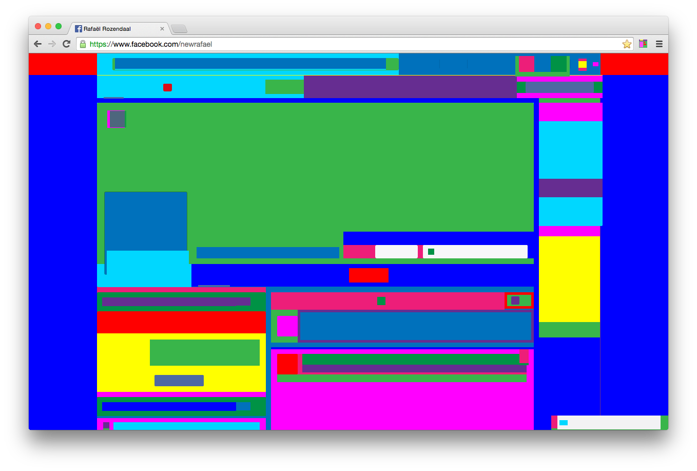
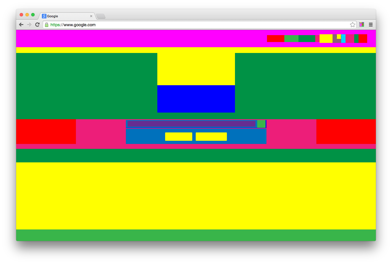
Abstract Browsing is a freely downloadable Chrome extension that transforms any website into a colorful abstract composition. Navigation remains intact: links function as usual, and the extension can be turned on or off at any time.
When activated, all web content is reduced to colored rectangles. Text, images, and other elements lose their meaning and remain only as structure. It resembles an X-ray of a building: not the finished surface, but the underlying framework becomes visible. Web pages reveal themselves as assemblies of smaller components, where information is constantly structured and categorized—something we rarely notice.
For me, this work exposes the underlying code and structure of the web. What is usually hidden within layout and styling comes to the surface. It sits between two moments: the act of structuring elements in code, and the final visual form as it appears in the browser.
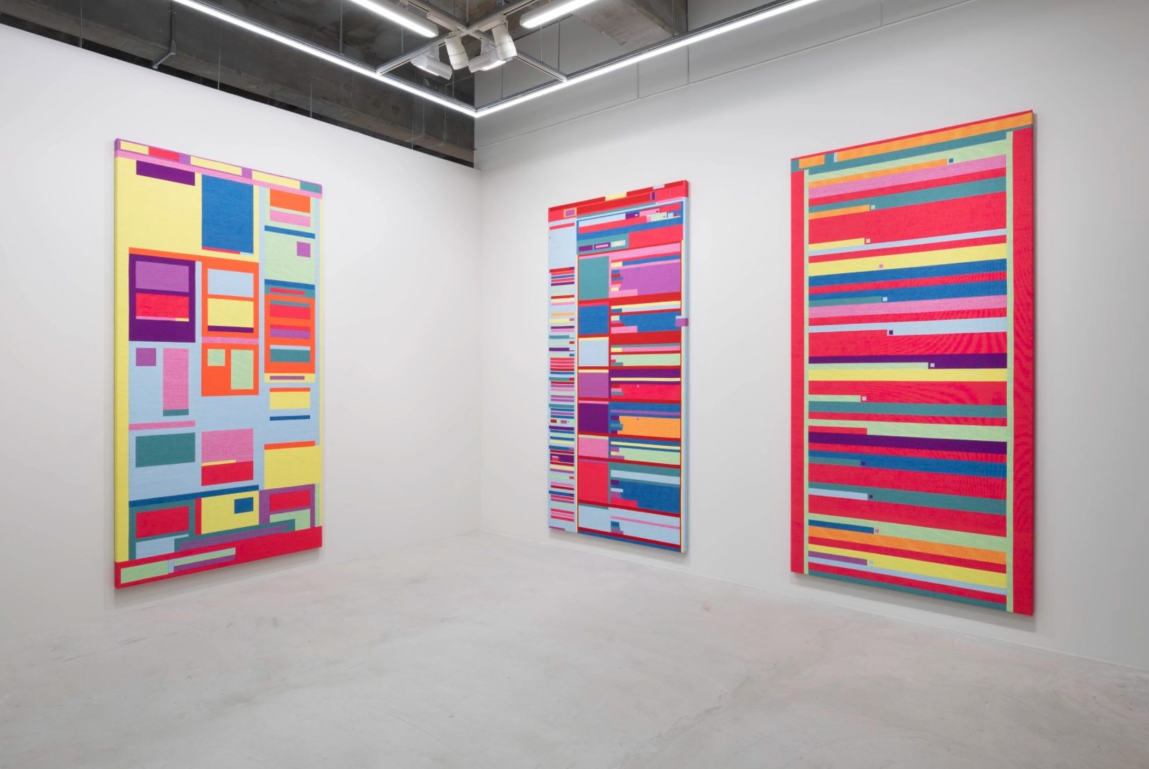
Because the results become autonomous works in their own right, Rafael Rozendaal later translated them into physical objects, such as woven paintings. As he notes: “The physicalization (weaving) brings focus. The software is fast and fluid, textile is expensive and slow. It slows me down, it helps me to pause and reflect.”
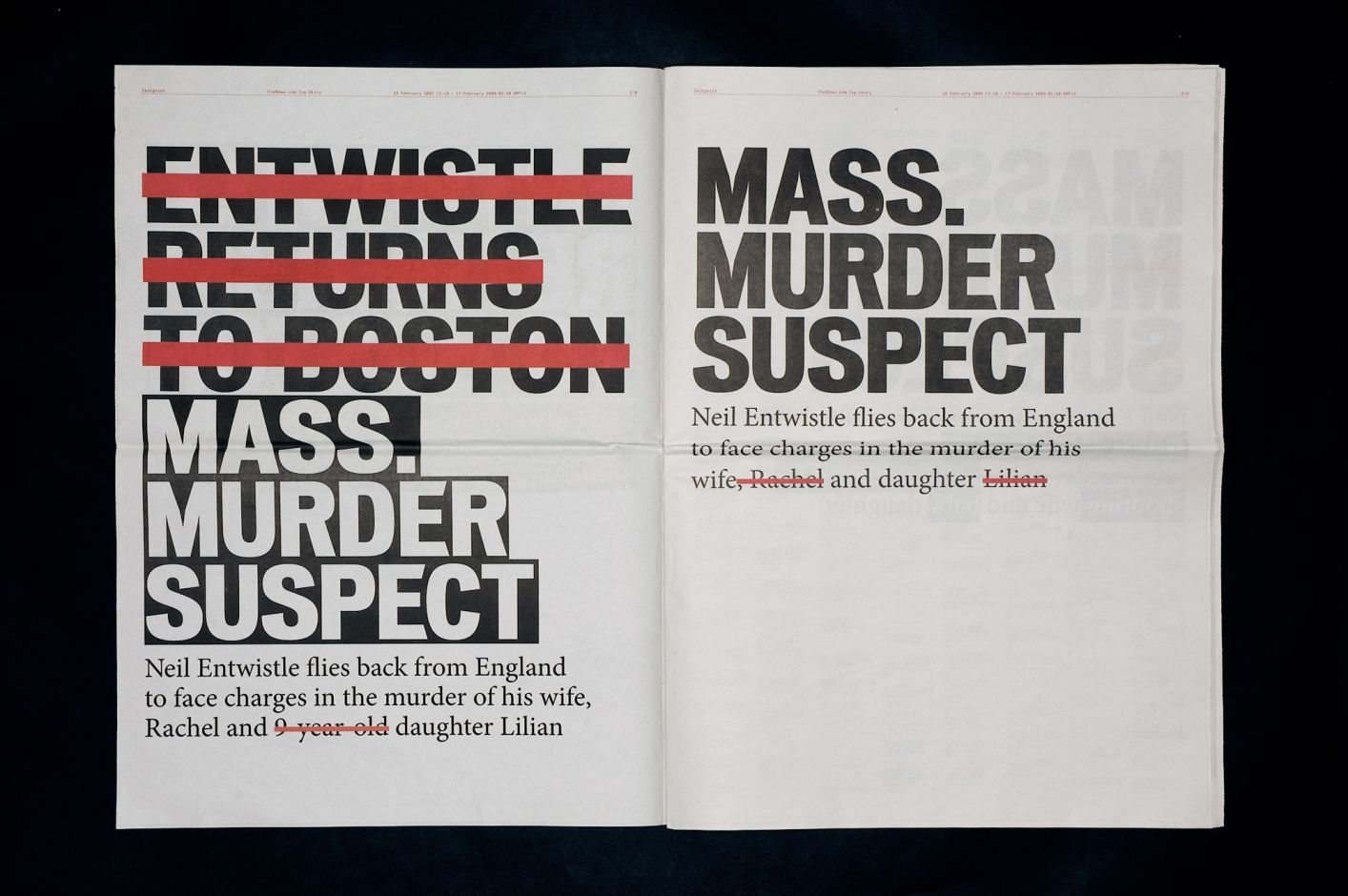
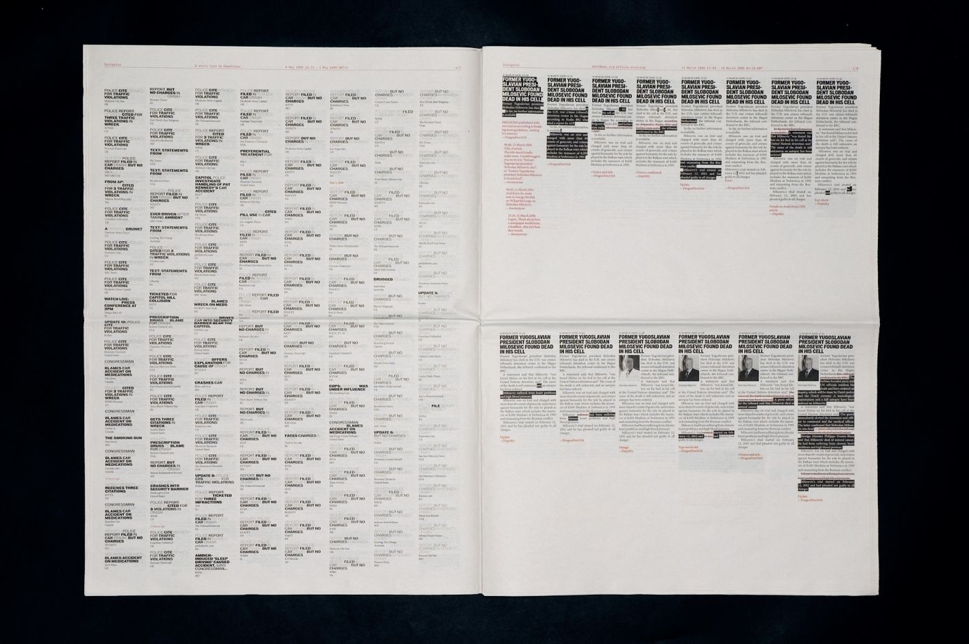
Zeitgeist (2006) by Jonathan Puckey (in collaboration with Peter Ström), starts from a simple observation: online news is never finished. It is continuously updated: headlines are rewritten, articles expanded, emphases shifted.
The work captures this instability by translating it back into a fixed form: the newspaper.
Rather than presenting news in a conventional way, it collects data from an article published on Foxnews.com and reworks it into a typographic system. Over a 24-hour period, the homepage is recorded and all changes are layered into a single image. Additions appear as new text, while deletions are marked in red strikethrough. Headlines from different media covering the same story are compared. Frequently repeated words begin to fade, while new or altered terms stand out. This exposes how headlines are constantly rewritten, often to improve visibility in search engines.
For me, the work shifts the focus away from the news itself to the way it is produced. By capturing headlines over time, it reveals how they evolve as new information comes in. The editorial process becomes visible: an online publication is not a final state, but an ongoing construction.
There is a clear tension here. The newspaper format suggests stability and closure, while the content it contains remains in flux.
Zeitgeist makes that contradiction tangible. It reveals what usually stays hidden: the continuous rewriting behind what we perceive as 'news.' In that sense, it connects to what I described in Rafael Rozendaal’s work; it operates between two layers, not the content itself, but the structure and process that produce it.
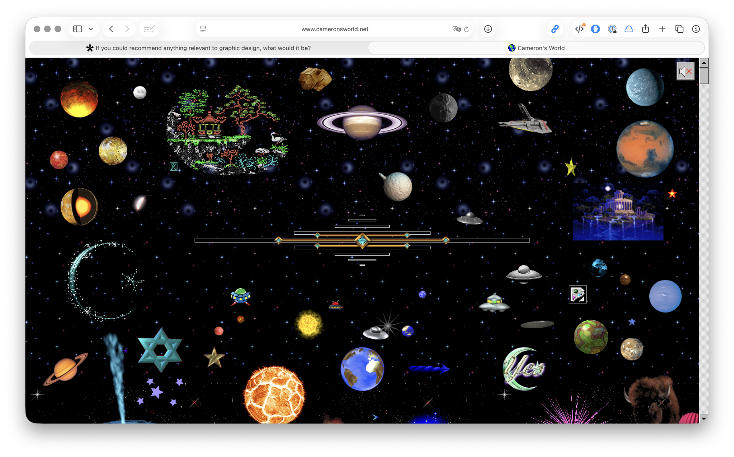
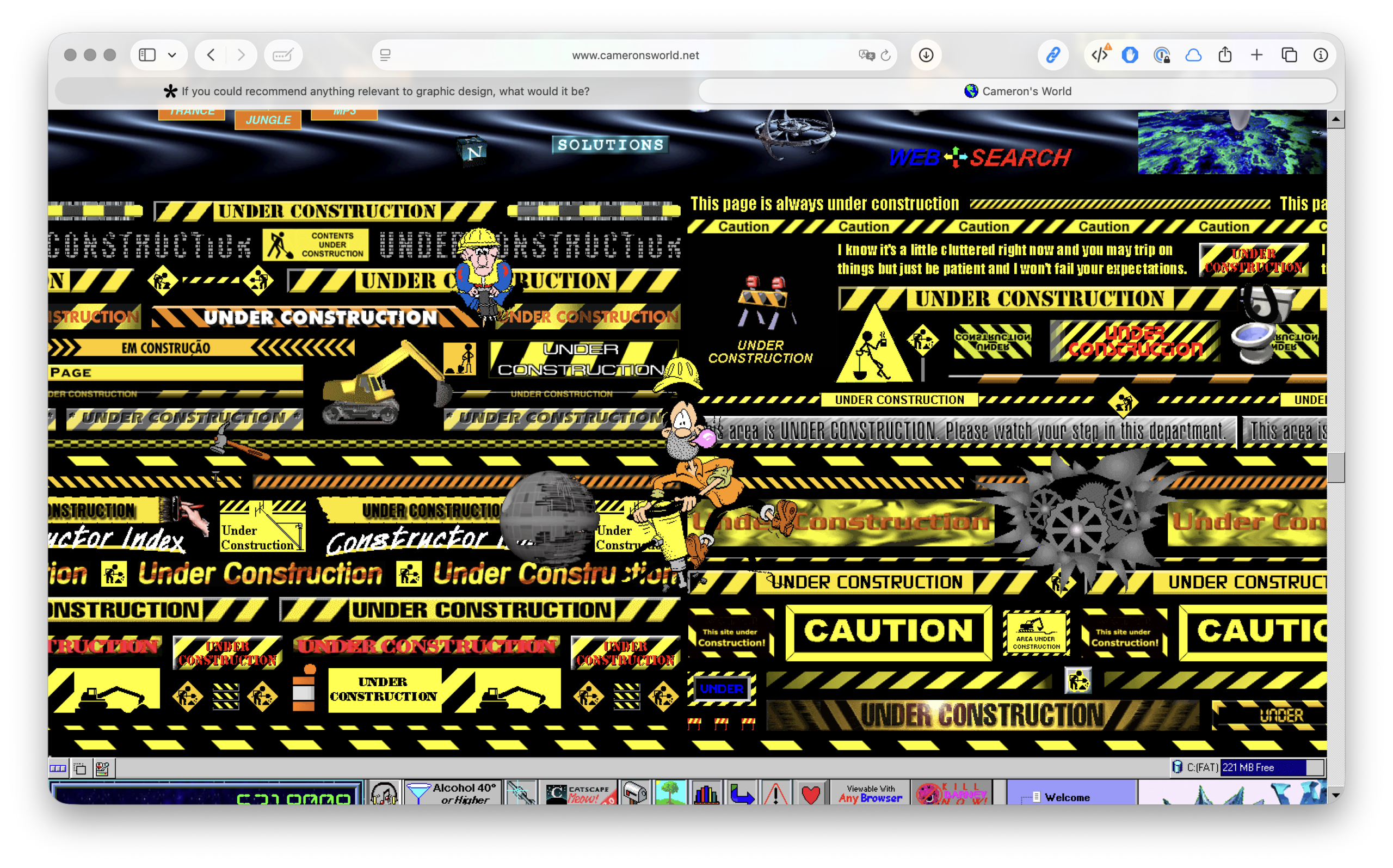
The project was created by Cameron Askin and consists of a large, scrollable collage of images, text and sounds sourced from old GeoCities pages (circa 1994–2009).
In the 1990s, GeoCities allowed people to create their own homepages, which were often messy, personal, full of GIFs and experimentation. When the service disappeared, millions of pages remained as archive material. Cameron’s World extracts fragments from these and stitches them together into a single navigable environment.
The site reconstructs the aesthetics of the early web: flashing GIFs, Comic Sans and bright colours, ‘under construction’ banners, MIDI music
That style was normal back then, but has now almost completely disappeared due to standardisation and design systems.
The work is not just about nostalgia. It shows an internet before platforms and algorithms
There were no templates, no UX rules and therefore a great deal of freedom, little consistency.
It is not the content itself that takes centre stage, but the structure and culture of the medium
With Rozendaal you see the structure of a page, with Puckey the process of news
Here you see the ecosystem of the early web itself.
If you could recommend anything relevant to graphic design, what would it be?
Must Know is the master's project of Kato Van Nerom, a Graphic Design student at LUCA School of Arts Ghent. Must Know is a curated website that publishes recommendations related to graphic design every two weeks. This project started from a desire to learn more about other designers and techniques within graphic design. With this project, I aim to share knowledge about graphic design in a simple and accessible way with fellow students and other interested readers.
By asking designers for their three absolute recommendations, Must Know aims to provide inspiration in the field of graphic design, without relying on algorithms or selections made by me. All recommendations are published online exactly as submitted, so the designer themselves is responsible for all information regarding their recommendation.
Intrigued to share your own must-knows as well? You can do so via the button 'Upload Your Must Knows Here' below. Enjoy the website, hopefully you’ll discover some new favourites along the way. :)