There is no archive for graphic design in the form of a professional heritage institution in Belgium. The knowledge center of VAi assists the field by mapping the heritage and sharing knowledge regarding archival care.
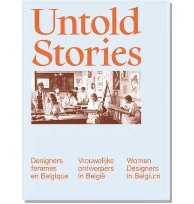
Untold Stories: Designers Femmes en Belgique/Vrouwelijke Ontwerpers in België/Women Designers in Belgium 1880-1980 is the continuation of the exhibition of the same name, which was held at the Design Museum Brussels until April 13, 2025. For the first time, it brought together the works of over 50 female designers and creators active in Belgium between 1880 and 1980.
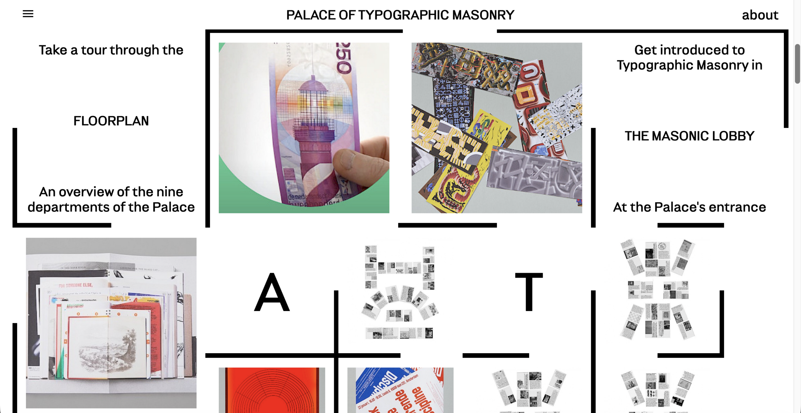
Palace of Typographic Masonry, Richard Niessen, 2016
An amazing project by Richard Niessen. In his own words: the Palace of Typographic Masonry is an (imaginary) institute for the splendour and variety of graphic languages.
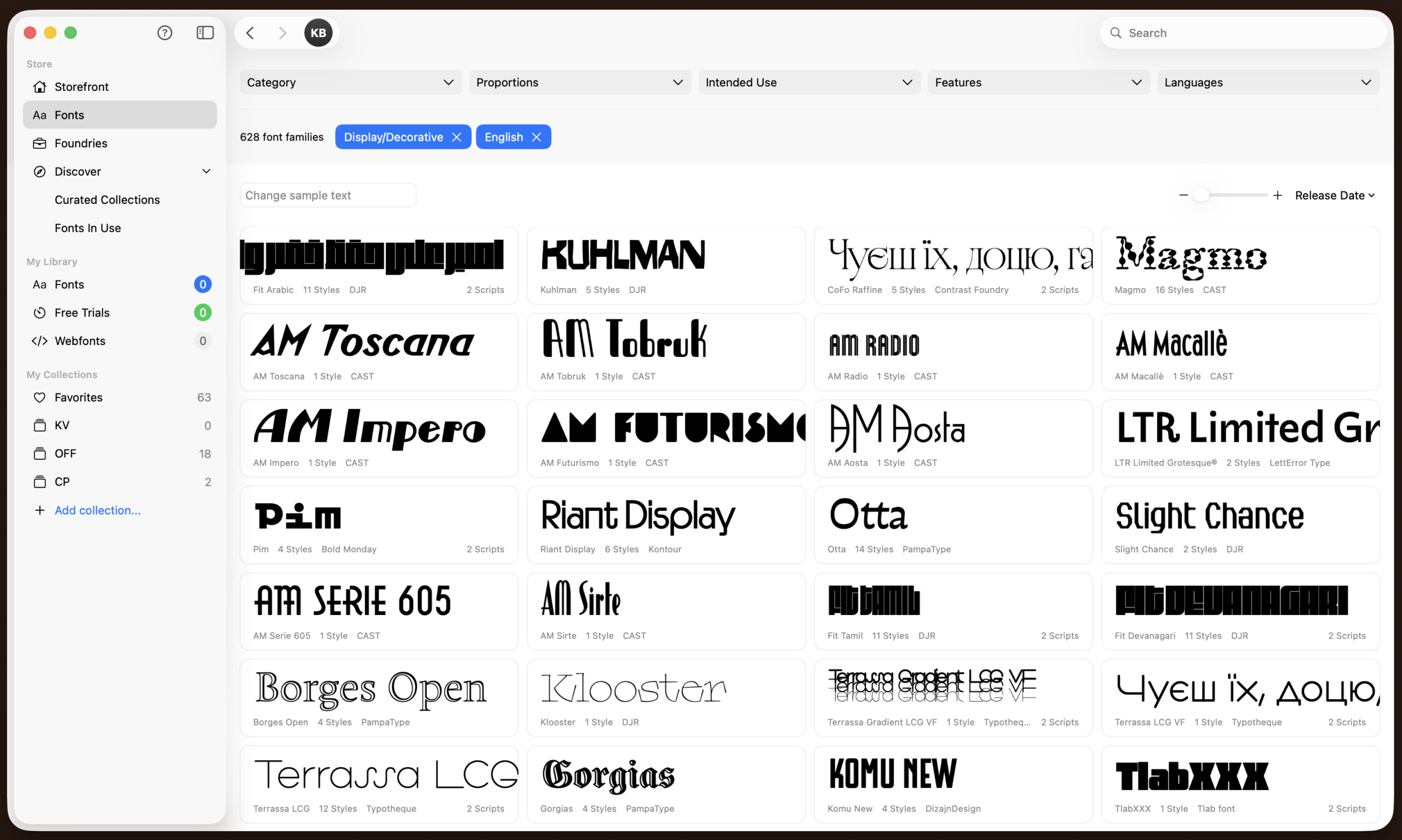
It's a website for font rental. Good tool for testing typefaces for free and if you like them you can rent a font for a small monthly fee, and after 12 months of renting, you automatically own the license.
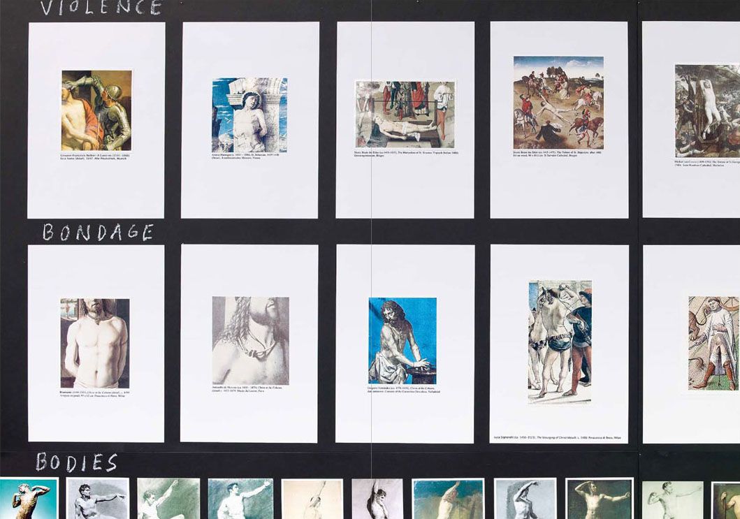
"Some Faggy Gestures the book" is better than the art work. The art work displays a large series of wooden panels on which Olesen lays out endless amounts of image clippings of the representation of queer bodies in classical painting, carefully categorized and labeled. We see images of male bodies fighting (very hot), mothers and their sons (very recongnizable), men bathing, butch women, effeminate poses (like hand in hip or staring into a distance). It's a striking work, yet the book is better as it provides a slower way of experiencing the work. Olesen's cut-out typography is charming and endearing. The work contains certain easter eggs, like some stills from a prison-themed porn video or a cute portrait of Queen's late frontman Freddie Mercury.
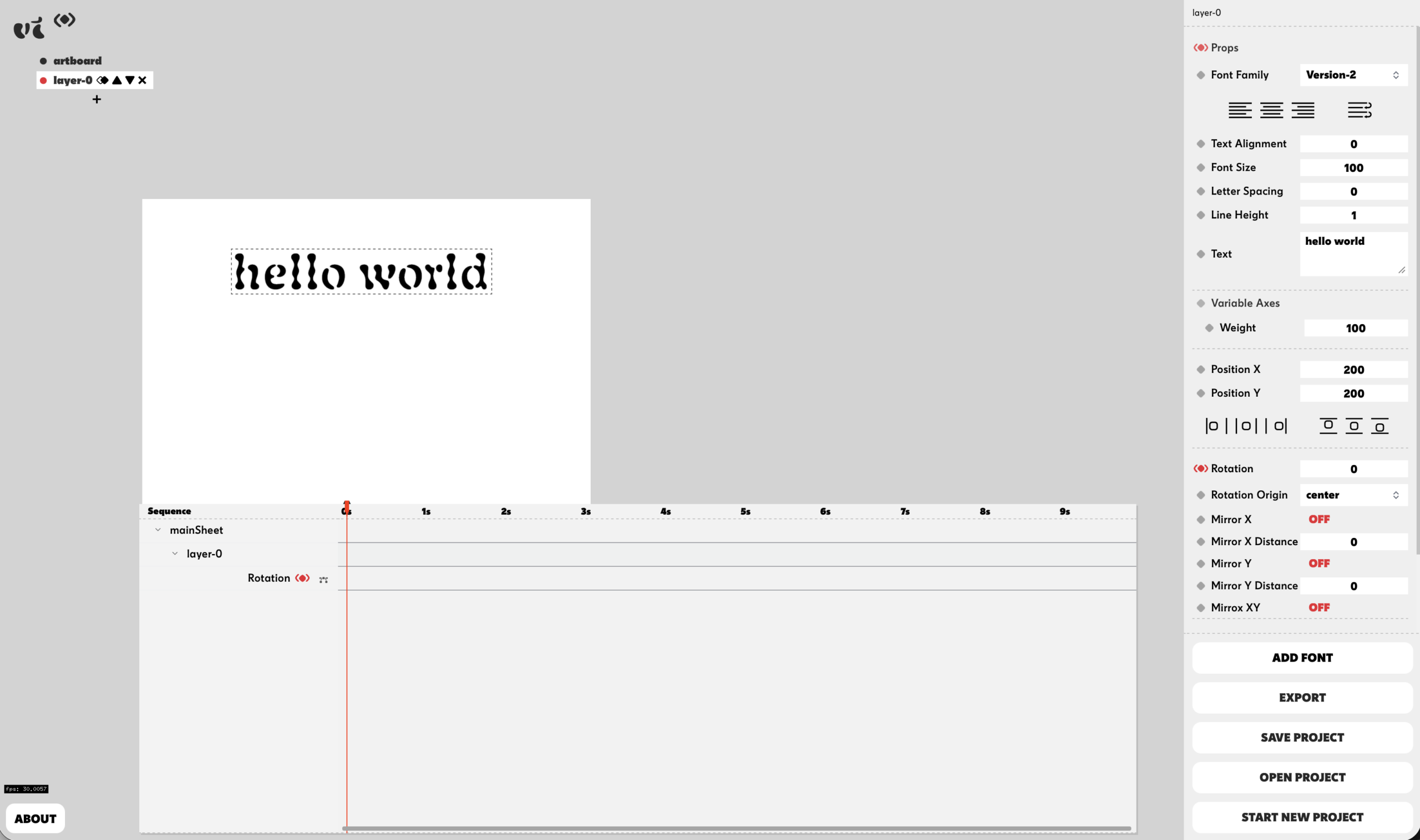
Variable Time was developed by Studio Pointer* in collaboration with me (Céline Hurka) as a free online tool to animate fonts and variable fonts. It's fully functioning and does not require sign-up.
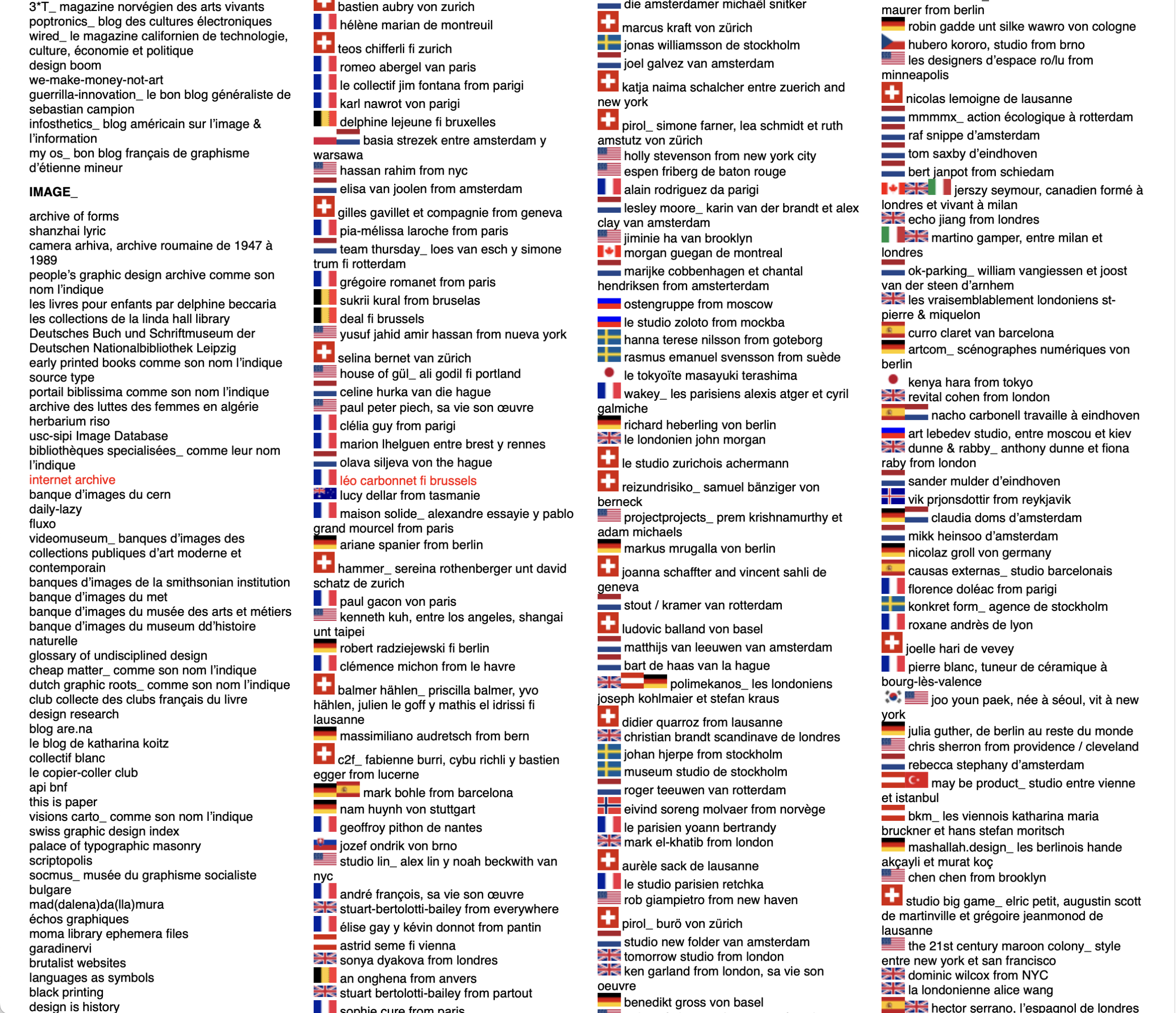
The largest online index of carefully selected designers / design agencies / typographers / artists etc., compiled by Thierry Chancogne (lecturer, theorist and writer on graphic design).
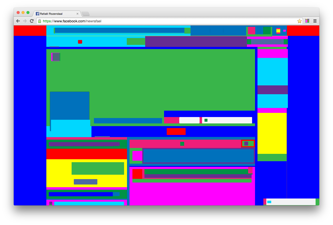
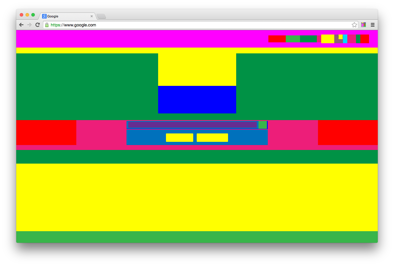
Abstract Browsing is a freely downloadable Chrome extension that transforms any website into a colorful abstract composition. Navigation remains intact: links function as usual, and the extension can be turned on or off at any time.
When activated, all web content is reduced to colored rectangles. Text, images, and other elements lose their meaning and remain only as structure. It resembles an X-ray of a building: not the finished surface, but the underlying framework becomes visible. Web pages reveal themselves as assemblies of smaller components, where information is constantly structured and categorized—something we rarely notice.
For me, this work exposes the underlying code and structure of the web. What is usually hidden within layout and styling comes to the surface. It sits between two moments: the act of structuring elements in code, and the final visual form as it appears in the browser.
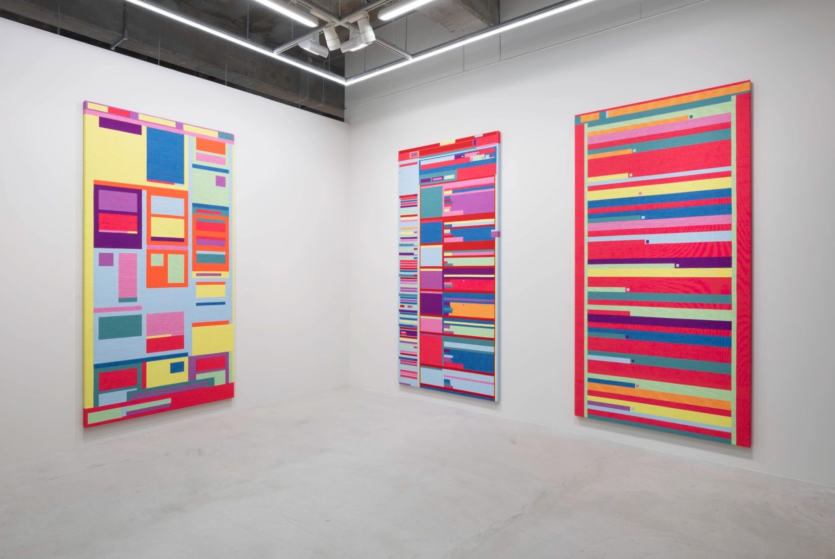
Because the results become autonomous works in their own right, Rafael Rozendaal later translated them into physical objects, such as woven paintings. As he notes: “The physicalization (weaving) brings focus. The software is fast and fluid, textile is expensive and slow. It slows me down, it helps me to pause and reflect.”
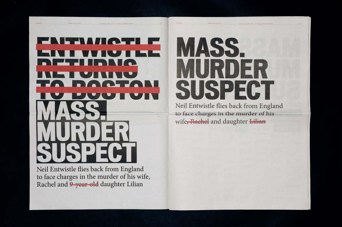
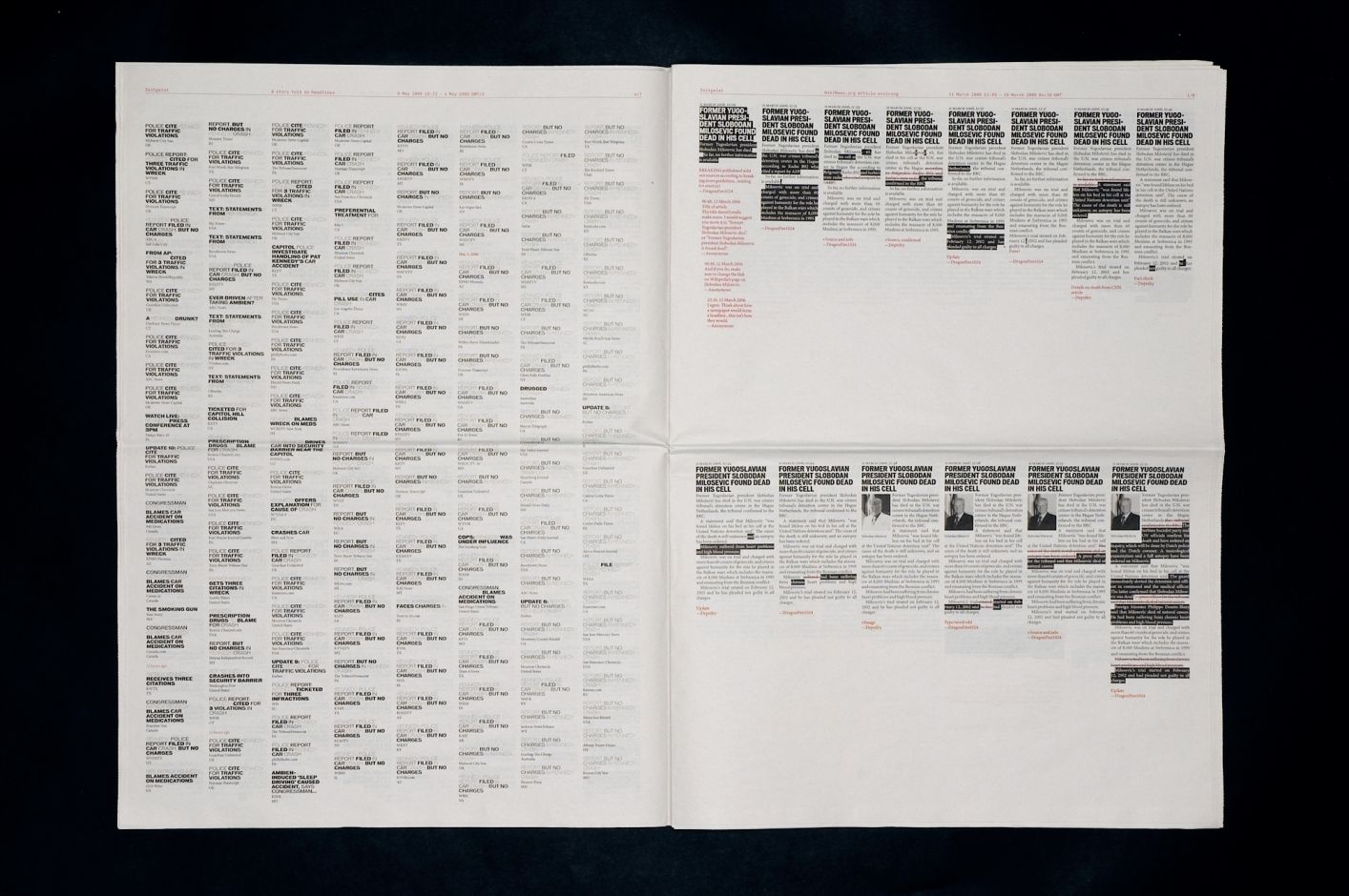
Zeitgeist (2006) by Jonathan Puckey (in collaboration with Peter Ström), starts from a simple observation: online news is never finished. It is continuously updated: headlines are rewritten, articles expanded, emphases shifted.
The work captures this instability by translating it back into a fixed form: the newspaper.
Rather than presenting news in a conventional way, it collects data from an article published on Foxnews.com and reworks it into a typographic system. Over a 24-hour period, the homepage is recorded and all changes are layered into a single image. Additions appear as new text, while deletions are marked in red strikethrough. Headlines from different media covering the same story are compared. Frequently repeated words begin to fade, while new or altered terms stand out. This exposes how headlines are constantly rewritten, often to improve visibility in search engines.
For me, the work shifts the focus away from the news itself to the way it is produced. By capturing headlines over time, it reveals how they evolve as new information comes in. The editorial process becomes visible: an online publication is not a final state, but an ongoing construction.
There is a clear tension here. The newspaper format suggests stability and closure, while the content it contains remains in flux.
Zeitgeist makes that contradiction tangible. It reveals what usually stays hidden: the continuous rewriting behind what we perceive as 'news.' In that sense, it connects to what I described in Rafael Rozendaal’s work; it operates between two layers, not the content itself, but the structure and process that produce it.
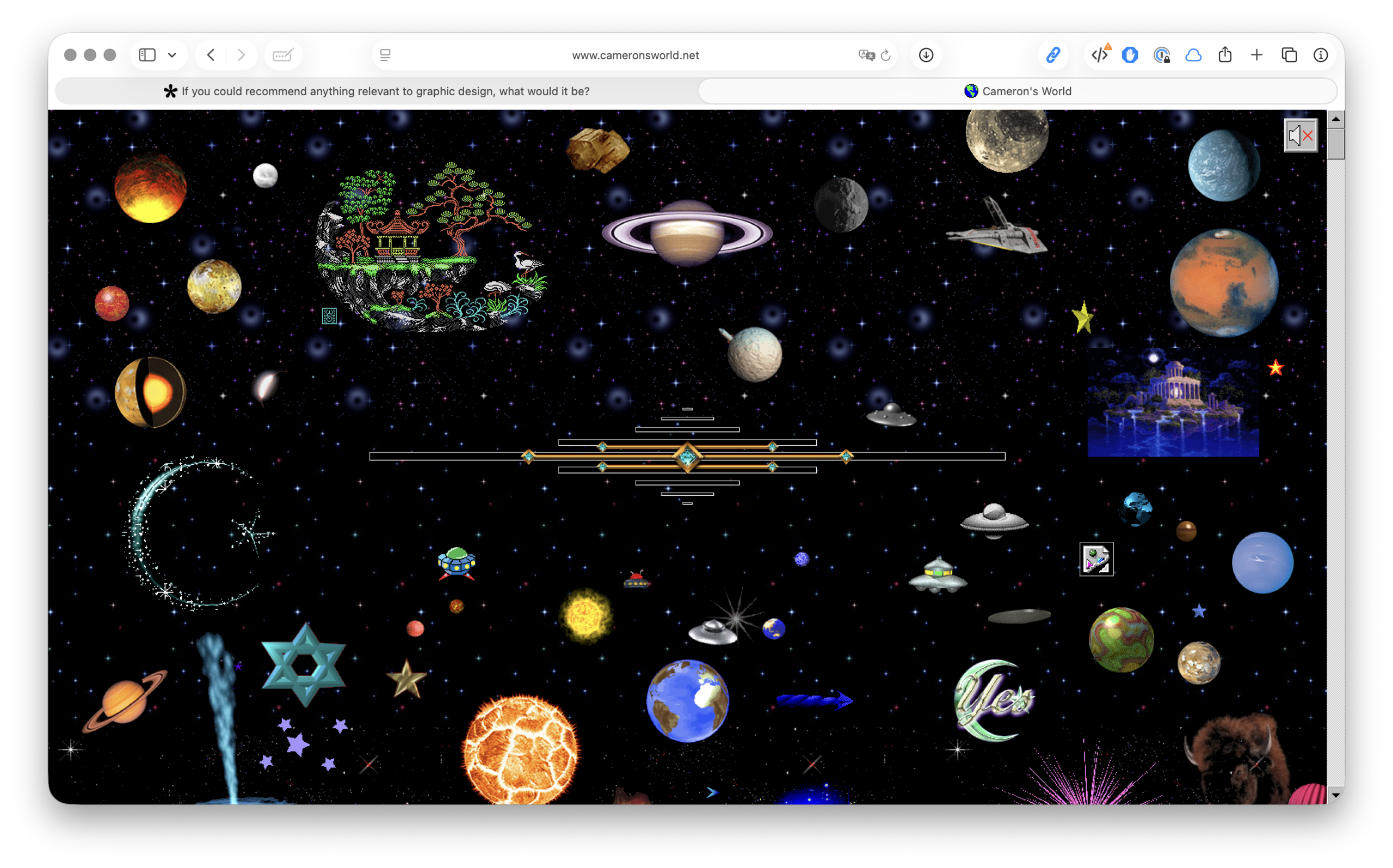
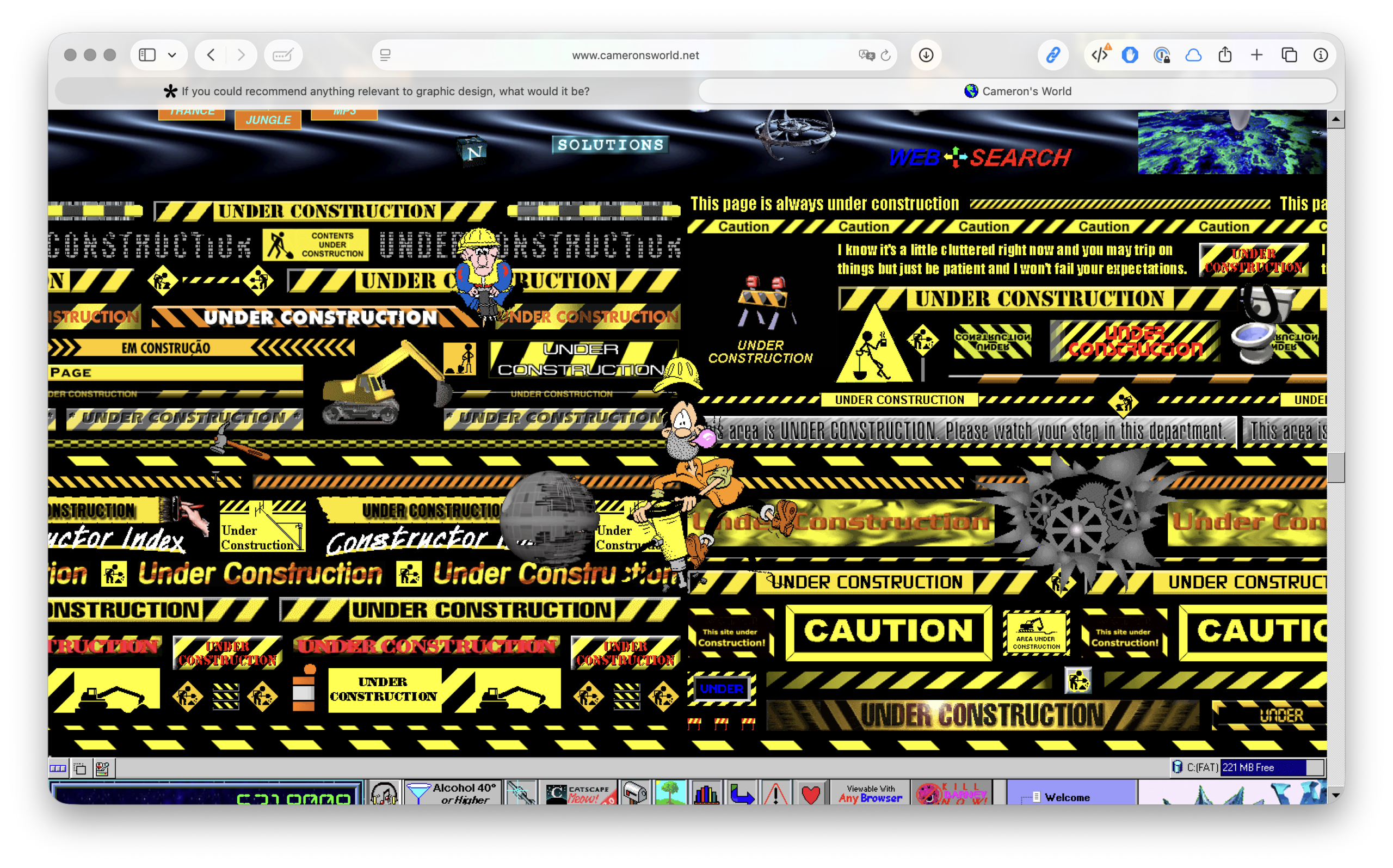
The project was created by Cameron Askin and consists of a large, scrollable collage of images, text and sounds sourced from old GeoCities pages (circa 1994–2009).
In the 1990s, GeoCities allowed people to create their own homepages, which were often messy, personal, full of GIFs and experimentation. When the service disappeared, millions of pages remained as archive material. Cameron’s World extracts fragments from these and stitches them together into a single navigable environment.
The site reconstructs the aesthetics of the early web: flashing GIFs, Comic Sans and bright colours, ‘under construction’ banners, MIDI music
That style was normal back then, but has now almost completely disappeared due to standardisation and design systems.
The work is not just about nostalgia. It shows an internet before platforms and algorithms
There were no templates, no UX rules and therefore a great deal of freedom, little consistency.
It is not the content itself that takes centre stage, but the structure and culture of the medium
With Rozendaal you see the structure of a page, with Puckey the process of news
Here you see the ecosystem of the early web itself.
If you could recommend anything relevant to graphic design, what would it be?
Must Know is the master's project of Kato Van Nerom, a Graphic Design student at LUCA School of Arts Ghent. Must Know is a curated website that publishes recommendations related to graphic design every two weeks. This project started from a desire to learn more about other designers and techniques within graphic design. With this project, I aim to share knowledge about graphic design in a simple and accessible way with fellow students and other interested readers.
By asking designers for their three absolute recommendations, Must Know aims to provide inspiration in the field of graphic design, without relying on algorithms or selections made by me. All recommendations are published online exactly as submitted, so the designer themselves is responsible for all information regarding their recommendation.
Intrigued to share your own must-knows as well? You can do so via the button 'Upload Your Must Knows Here' below. Enjoy the website, hopefully you’ll discover some new favourites along the way. :)