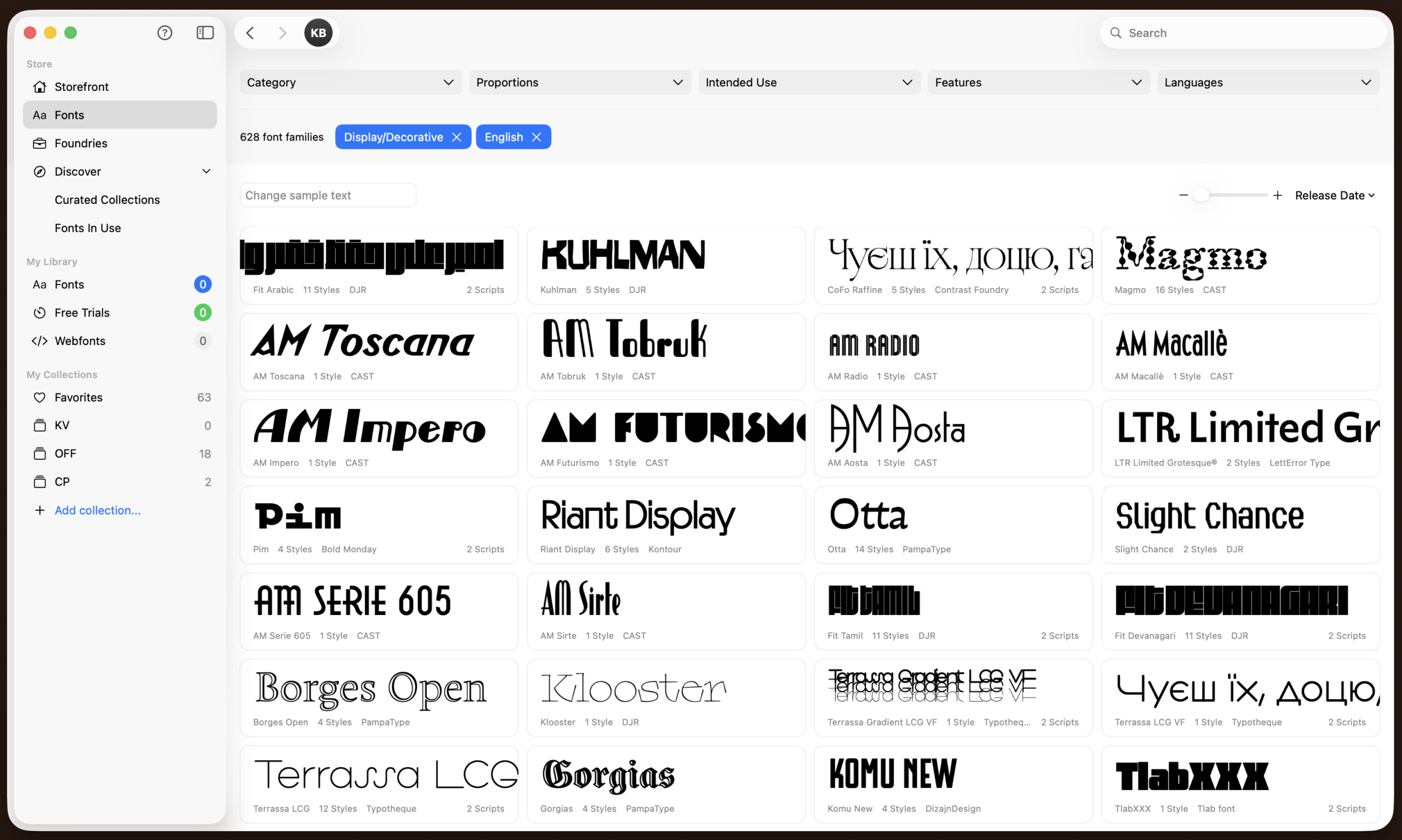
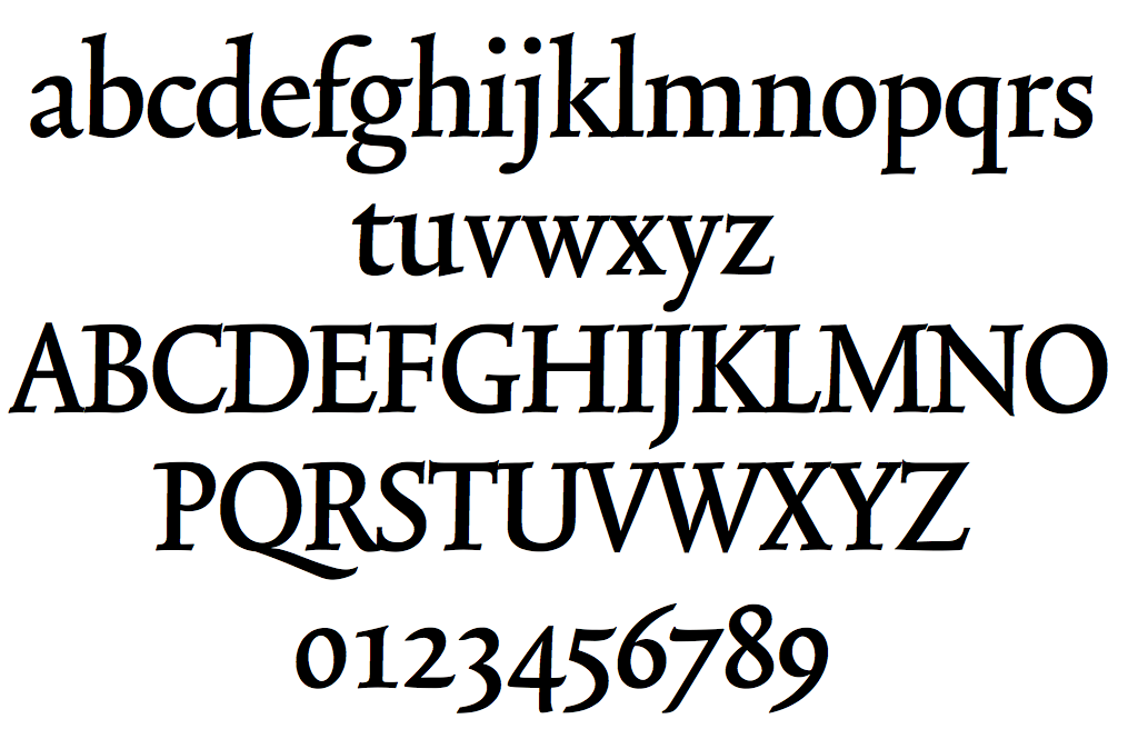
It's a website for font rental. Good tool for testing typefaces for free and if you like them you can rent a font for a small monthly fee, and after 12 months of renting, you automatically own the license.
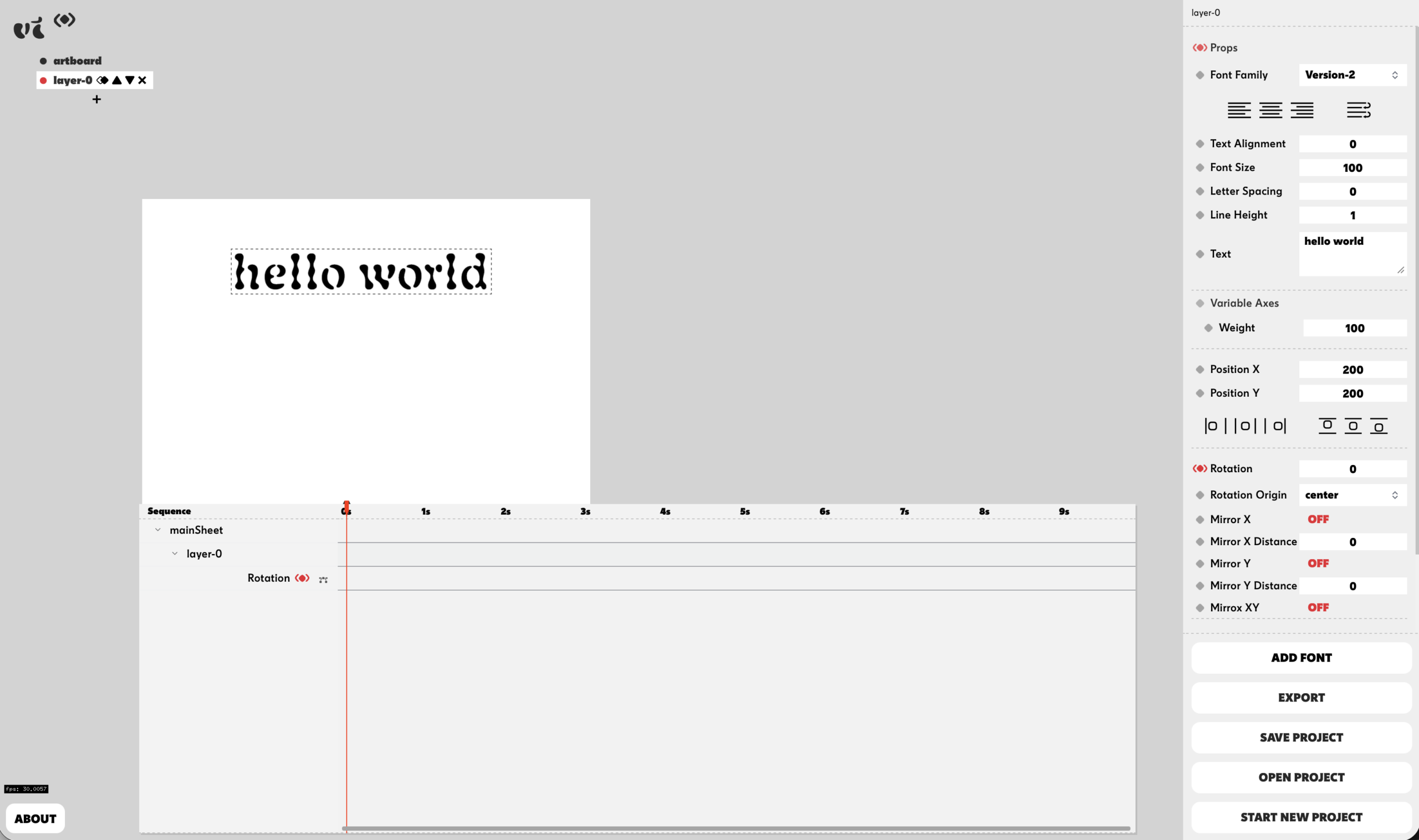
Variable Time was developed by Studio Pointer* in collaboration with me (Céline Hurka) as a free online tool to animate fonts and variable fonts. It's fully functioning and does not require sign-up.
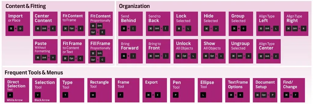
There are so many shortcuts you can use in Indesign that makes life easier. I highly recommend researching them. Some others not included in this list:
- While adding frames or images, simply start dragging a rectangle and use the 'up' and 'right' arrow key to make more squares while you're placing the images.
- When 1-clicked on a textframe press 'j' key to immediately change textcolour in that frame.
- Use the find and replace function for applying styles / colours / ...
- Research GREP!!!
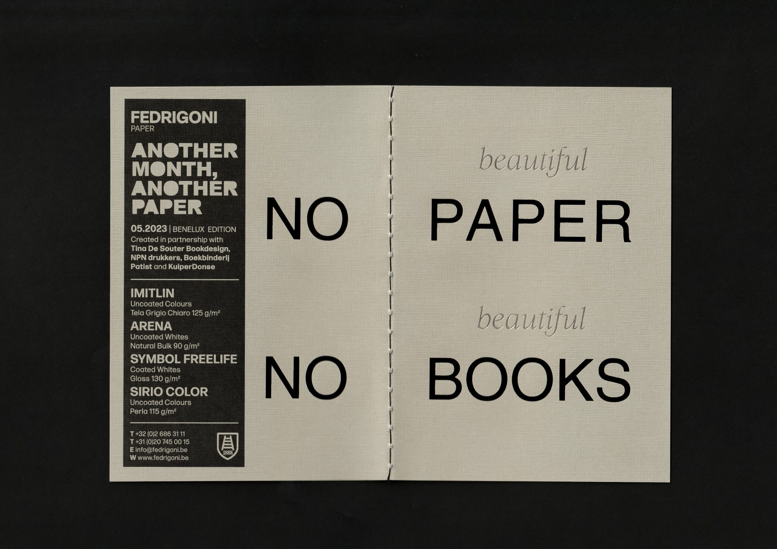
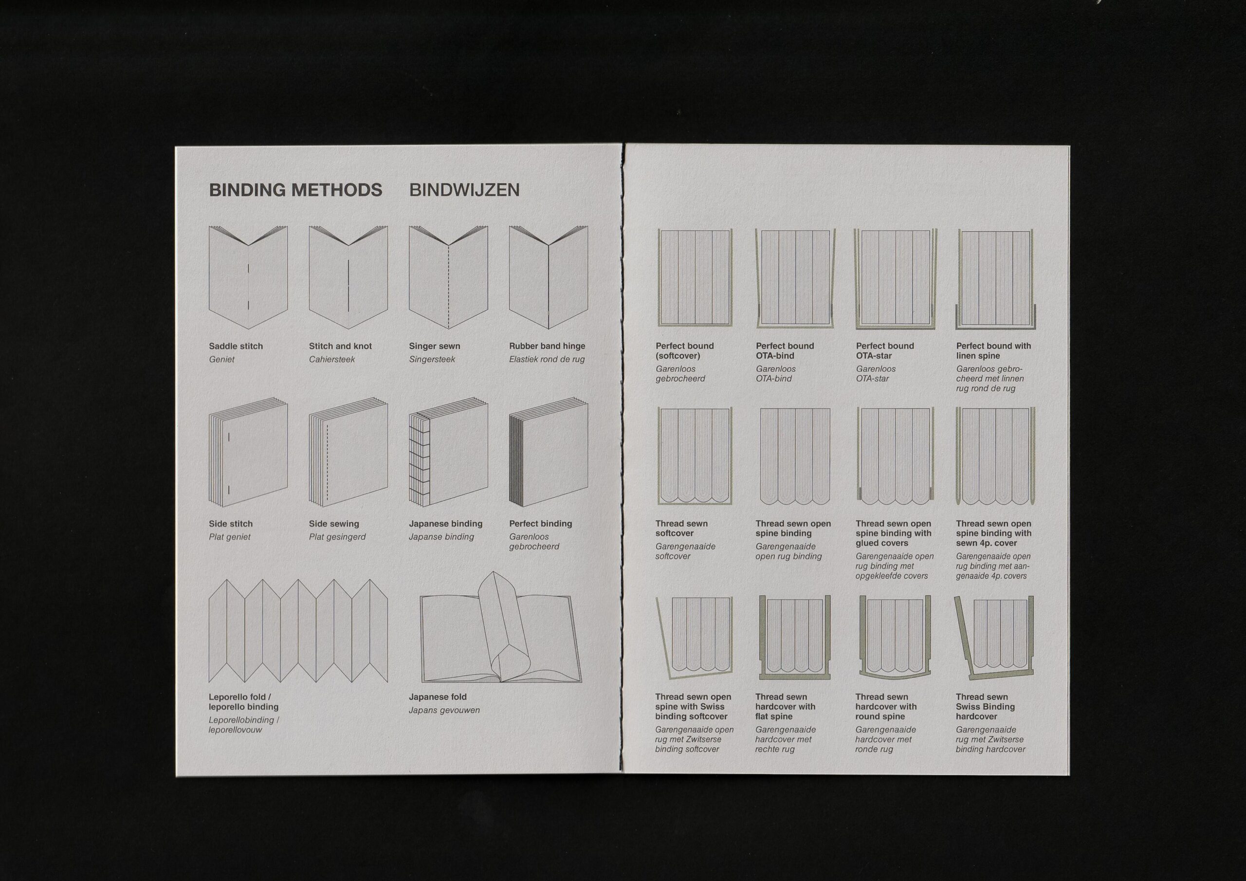
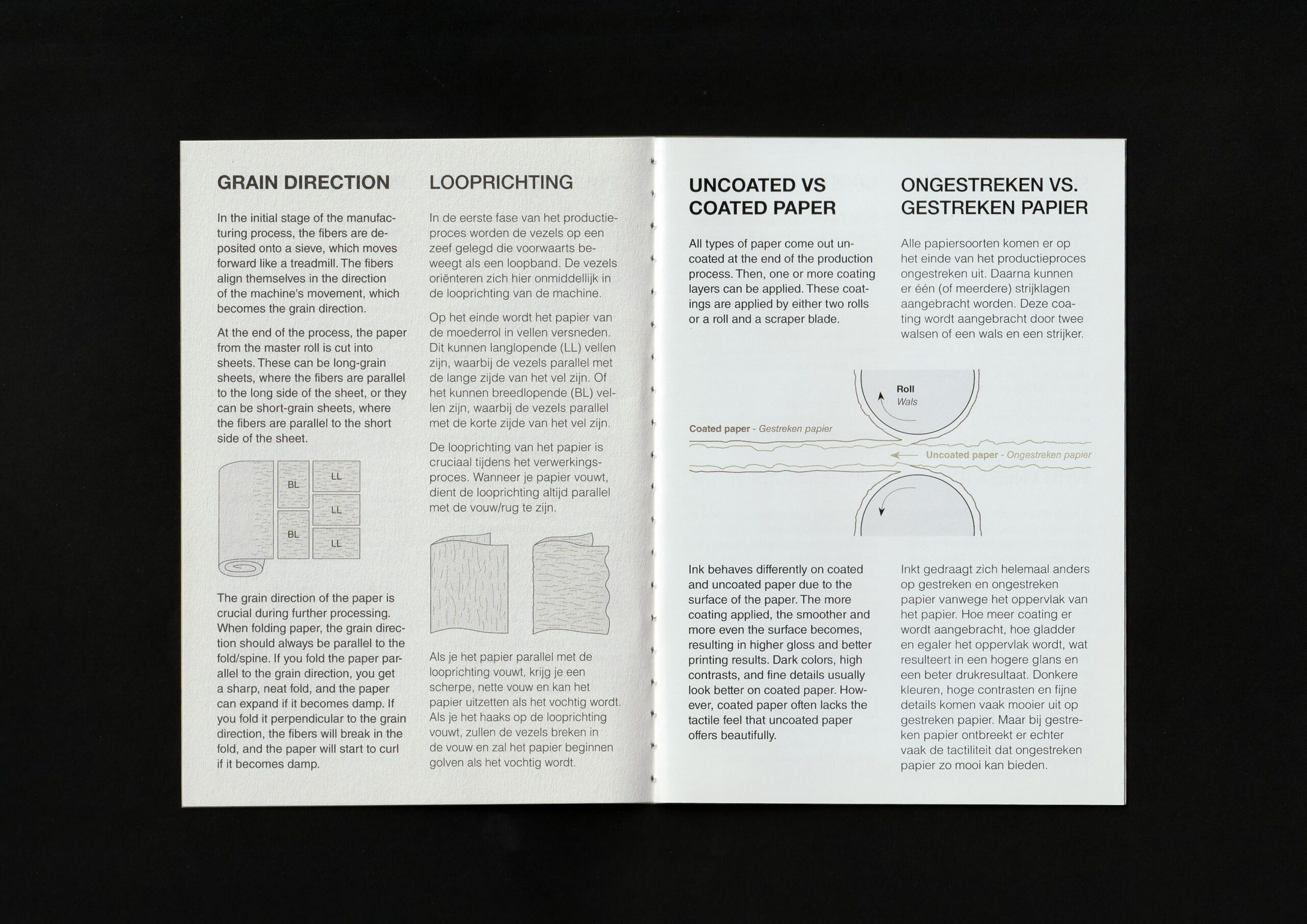
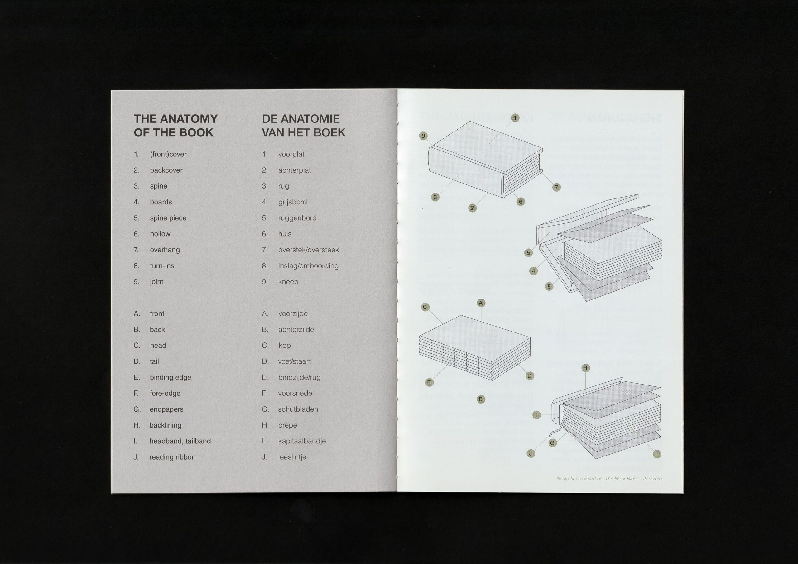
For the AMAP of Fedrigoni (Another Month Another Paper) I created a small booklet full of information on books and paper. It includes how paper is made, what different papers exist, how to use paper in books, the anatomy of books, binding methods, etc.
I call it 'a little bible on paper and books'.
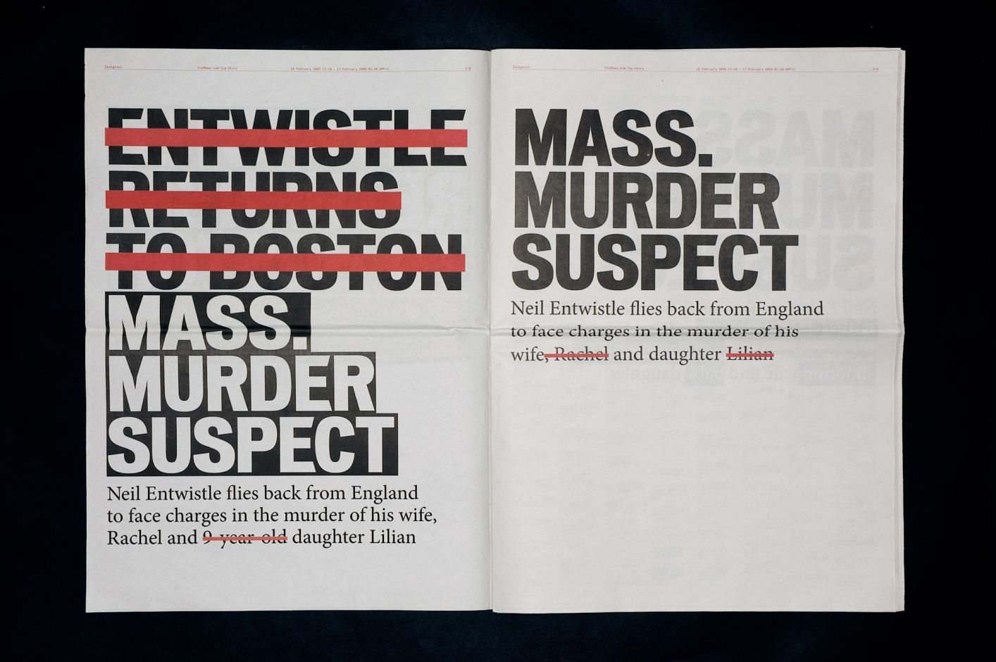
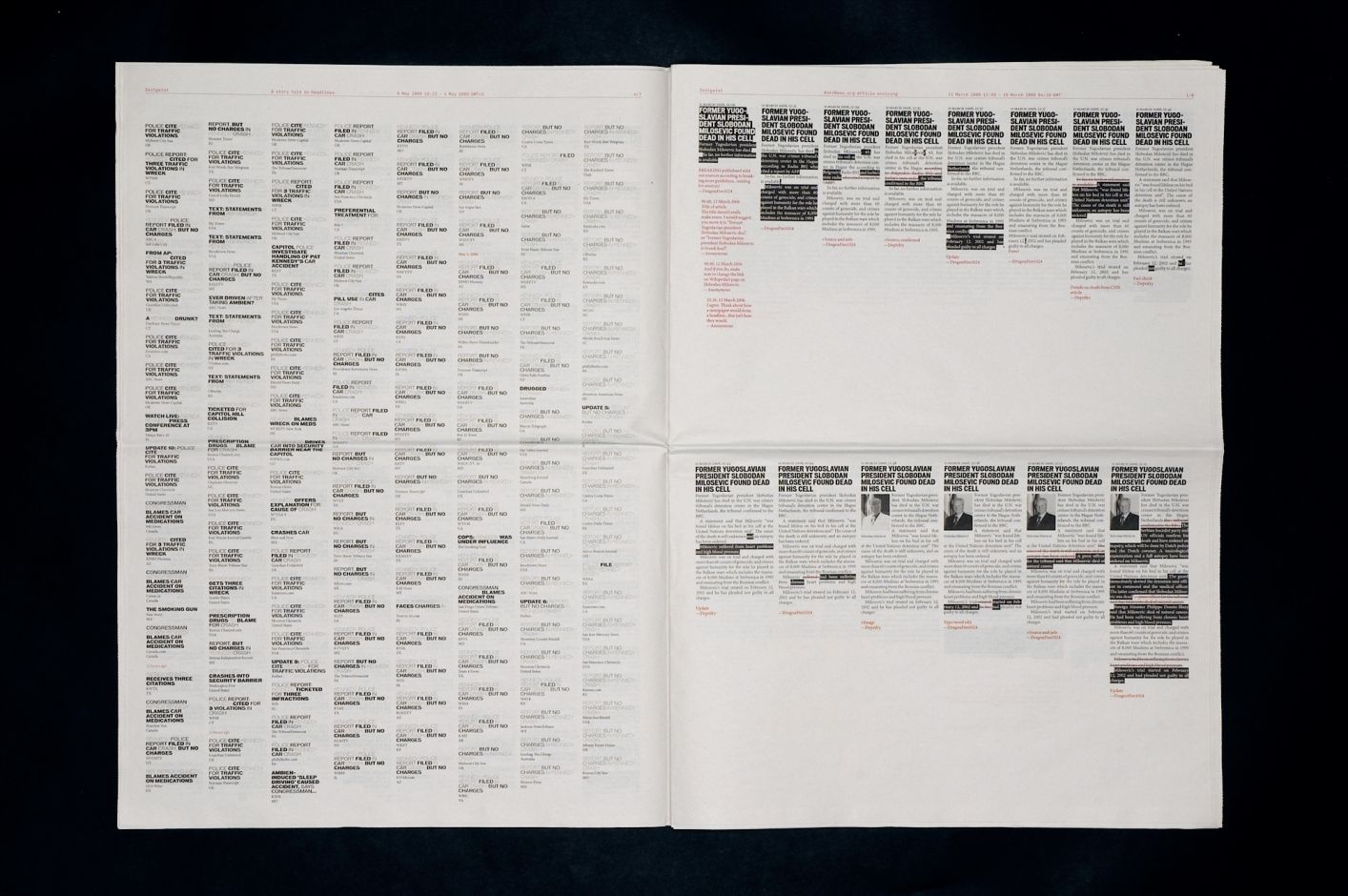
Zeitgeist (2006) by Jonathan Puckey (in collaboration with Peter Ström), starts from a simple observation: online news is never finished. It is continuously updated: headlines are rewritten, articles expanded, emphases shifted.
The work captures this instability by translating it back into a fixed form: the newspaper.
Rather than presenting news in a conventional way, it collects data from an article published on Foxnews.com and reworks it into a typographic system. Over a 24-hour period, the homepage is recorded and all changes are layered into a single image. Additions appear as new text, while deletions are marked in red strikethrough. Headlines from different media covering the same story are compared. Frequently repeated words begin to fade, while new or altered terms stand out. This exposes how headlines are constantly rewritten, often to improve visibility in search engines.
For me, the work shifts the focus away from the news itself to the way it is produced. By capturing headlines over time, it reveals how they evolve as new information comes in. The editorial process becomes visible: an online publication is not a final state, but an ongoing construction.
There is a clear tension here. The newspaper format suggests stability and closure, while the content it contains remains in flux.
Zeitgeist makes that contradiction tangible. It reveals what usually stays hidden: the continuous rewriting behind what we perceive as 'news.' In that sense, it connects to what I described in Rafael Rozendaal’s work; it operates between two layers, not the content itself, but the structure and process that produce it.
If you could recommend anything relevant to graphic design, what would it be?
Must Know is the master's project of Kato Van Nerom, a Graphic Design student at LUCA School of Arts Ghent. Must Know is a curated website that publishes recommendations related to graphic design every two weeks. This project started from a desire to learn more about other designers and techniques within graphic design. With this project, I aim to share knowledge about graphic design in a simple and accessible way with fellow students and other interested readers.
By asking designers for their three absolute recommendations, Must Know aims to provide inspiration in the field of graphic design, without relying on algorithms or selections made by me. All recommendations are published online exactly as submitted, so the designer themselves is responsible for all information regarding their recommendation.
Intrigued to share your own must-knows as well? You can do so via the button 'Upload Your Must Knows Here' below. Enjoy the website, hopefully you’ll discover some new favourites along the way. :)